Instagram Rolls Out Liquid Glass Interface for Global Users
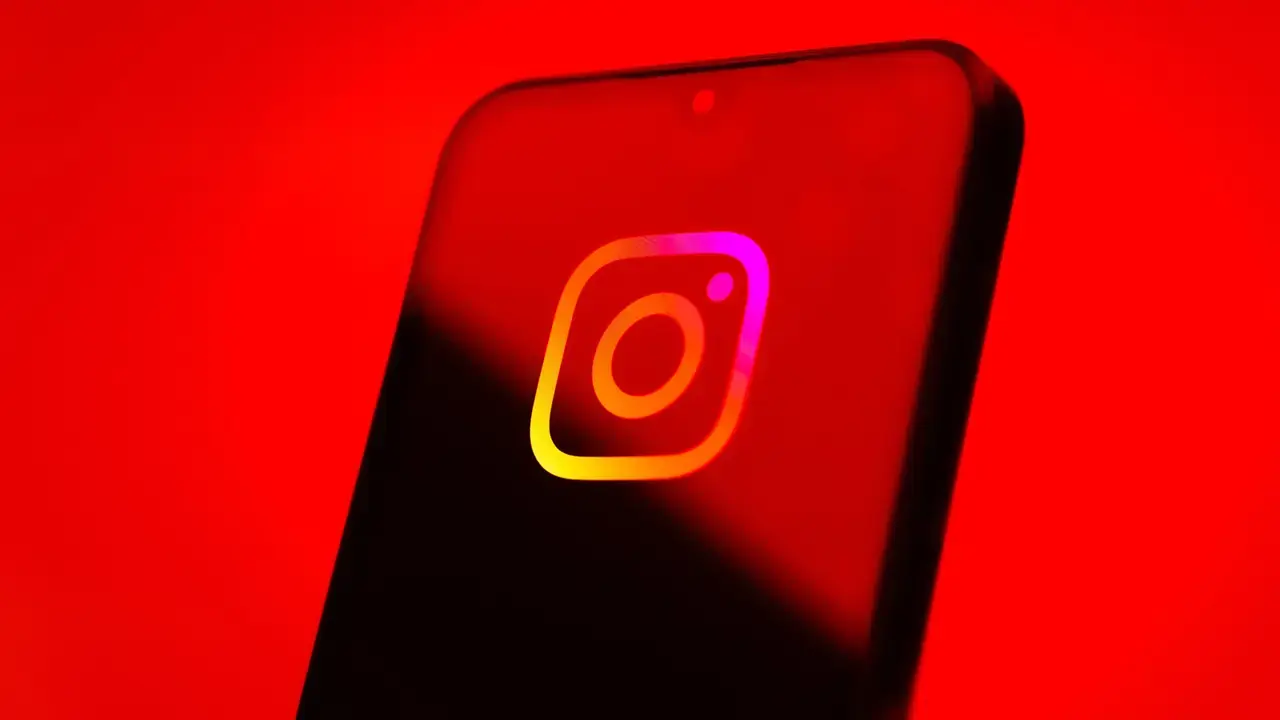
Instagram has officially launched its highly anticipated “Liquid Glass” interface design to a broader global audience this week, including iPhone users in Turkey. This significant visual update aims to modernize the platform experience by aligning it more closely with Apple’s minimalist aesthetic standards. By introducing a transparent bottom navigation bar and refined UI elements, Meta is enhancing the fluidity and visual depth of the application. Users can experience these changes immediately by updating their Instagram app to the latest version, as the company continues to refine its design strategy to prioritize a cleaner, more intuitive user environment across its ecosystem.
- Instagram has expanded the global availability of its Liquid Glass design language to improve platform aesthetics.
- The update introduces a transparent navigation bar to enhance the visual clarity of the interface.
- Users can now utilize a drag-and-drop feature to manually rearrange their profile grid layouts.
Transparent design elements significantly improve the visual depth of the social media experience.
Profile Customization Features Are Now Empowering Users
Beyond the architectural overhaul of the interface, Instagram has finally addressed a long-standing request from its creator community. Following the initial announcement on June 12, 2025, the platform has rolled out a “drag-and-drop” functionality for profile grids. This feature allows users to move their posts manually, breaking away from the rigid chronological limitations that previously dictated feed appearances. For those who prioritize personal branding or specific aesthetic themes on their profiles, this update provides unprecedented control over their digital presentation.
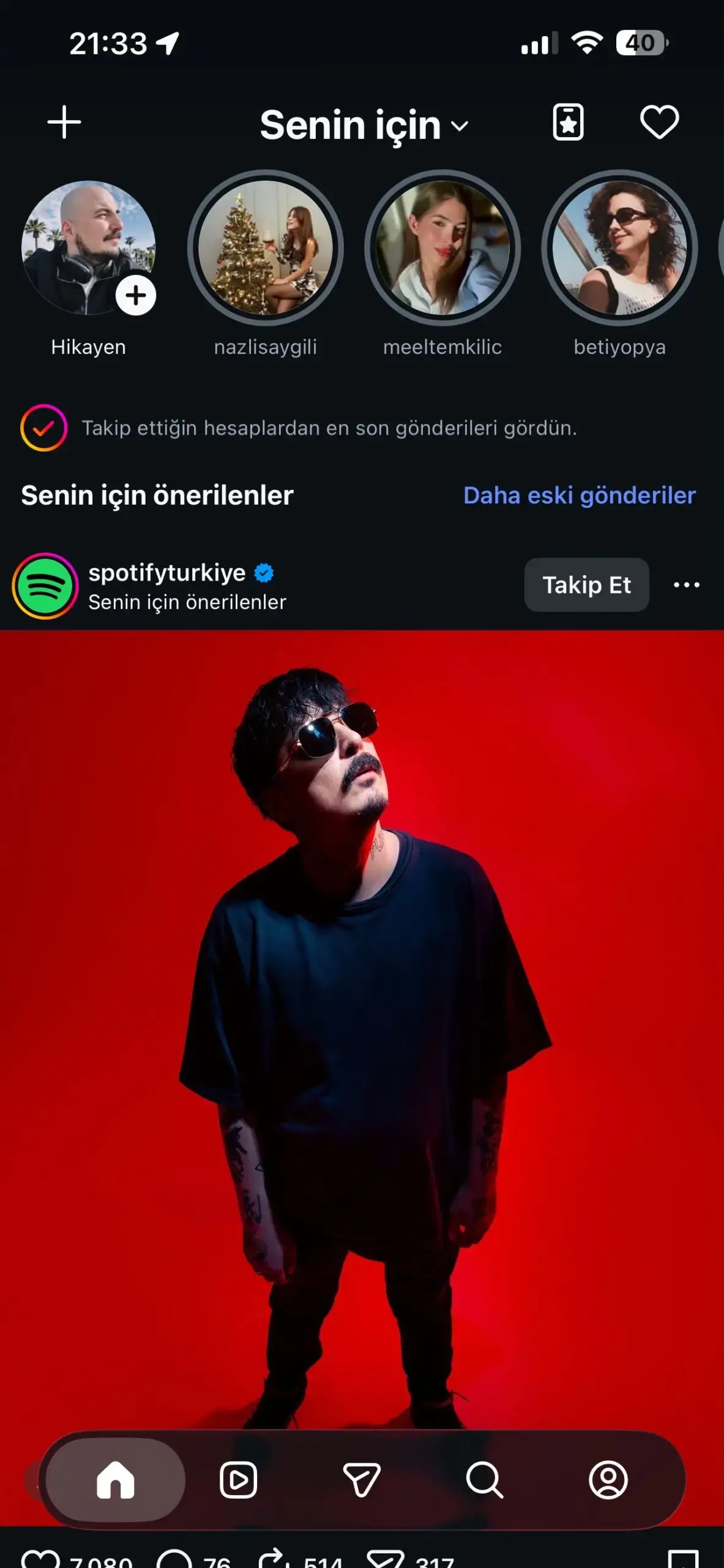
This shift represents a fundamental change in how users curate their public-facing content. By moving away from a fixed, time-based display, Instagram is acknowledging the importance of self-expression and creative autonomy. Users no longer need to worry about the order of publication impacting the visual harmony of their grid, as they can now reorganize their history to suit their current artistic vision.
Modern Design Principles Are Improving User Experience
The transition to the Liquid Glass design is not merely a stylistic choice; it is a functional upgrade that aligns Instagram with the broader Apple design ecosystem. The implementation of a transparent bottom navigation bar successfully reduces visual clutter, allowing users to focus more intensely on the shared media. This minimalist approach is particularly beneficial for high-resolution content creators who require a distraction-free environment to display their work effectively.
Users now possess the ability to customize their profile grids to reflect their unique aesthetic preferences.
As Instagram continues to push these software updates, the company is also focusing on underlying performance optimizations to ensure that the new visual layers do not impede app speed. Developer teams are working to minimize technical friction, aiming for a seamless rollout to all iOS users within the coming weeks. This commitment to iterative design reflects Meta’s broader goal of increasing user retention by creating an interface that feels as premium as the content being shared upon it.
How are you finding the new Liquid Glass aesthetic on your Instagram profile? Do you feel that the new transparent elements improve your navigation experience, or do you prefer the utility of the previous version? Share your thoughts and feedback in the comments section below.
Your comment has been submitted,
it will be published after approval.