WhatsApp Brings Liquid Glass Design to iPad App
WhatsApp is currently modernizing its user experience across the Apple ecosystem by introducing the sleek Liquid Glass design to its iPad application. Following a successful rollout for iPhone users over the past few months, the popular messaging platform is now testing this visual interface on its tablet version. Spotted by WABetaInfo in the latest iPadOS beta, the update aligns the application with the refined aesthetic language of modern iOS releases. By integrating translucent elements and fluid animations, WhatsApp aims to improve how users interact with their chats on larger screens, ensuring the platform remains visually consistent with contemporary Apple design standards.
- WhatsApp is testing a new Liquid Glass design that features translucent tabs and floating sidebars for iPadOS users.
- The update enhances visual depth by allowing chat backgrounds and media to remain partially visible behind interface elements.
- Developers are currently conducting a limited TestFlight rollout to monitor performance and stability before a public release.
- The design initiative aims to unify the visual experience across iPhone, iPad, and Mac platforms.
This transition to a transparent design language represents the most significant aesthetic overhaul for the WhatsApp iPad client in recent years.
New Features Enhance the iPad Interface
The most prominent change in the iPad application involves the navigation bar located at the bottom of the screen. Previously, this area featured a static, opaque color that felt disconnected from the rest of the interface. With the new Liquid Glass implementation, the bar now floats above the chat content as a semi-transparent layer. As users scroll through their conversations, a subtle blur effect allows photos and message bubbles to pass behind the navigation elements, providing a sense of depth that makes the app feel less cluttered and more spacious.
The navigation bar at the top of the chat list also adopts this transparency trend. As users scroll downward, the header gradually becomes more transparent, revealing the underlying content in a dynamic fashion. 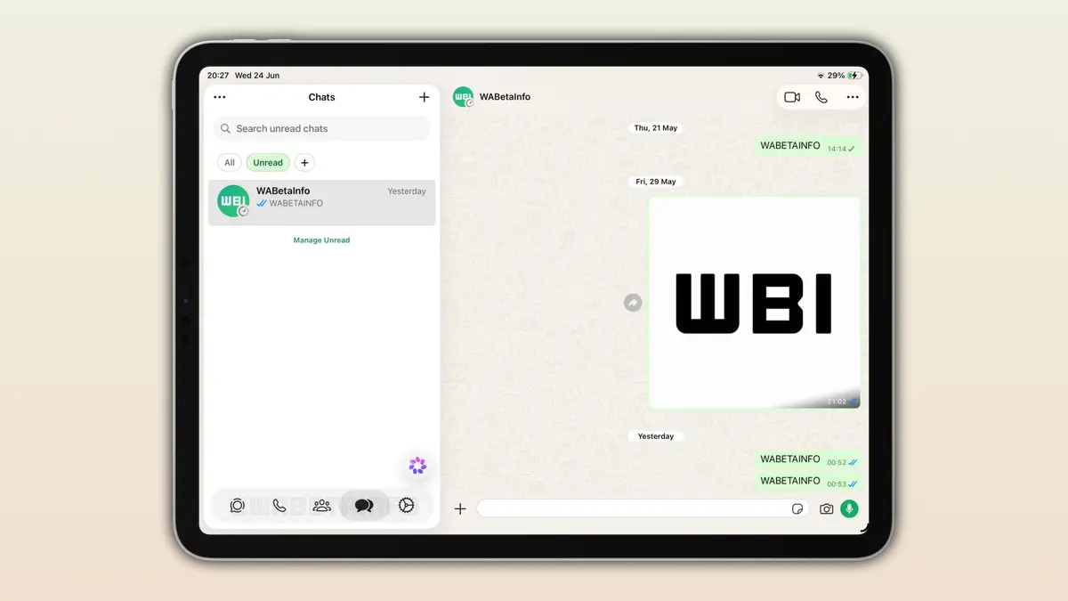 Additionally, context menus and interactive buttons have been updated with a frosted glass effect similar to what was introduced on the iPhone. These elements respond to touch inputs with fluid, natural animations, contributing to a premium feel that better utilizes the iPad’s display real estate.
Visual Consistency Defines the Apple Ecosystem
Meta has been steadily implementing the Liquid Glass design philosophy since the final quarter of last year, starting with iPhone chat screens and settings menus. By extending this design to the iPad, the company demonstrates its commitment to optimizing software for large-screen tablets. The move aligns WhatsApp with the broader aesthetic shifts introduced in iOS 26, iPadOS 26, and macOS 26, which prioritize light-responsive surfaces and layered glass effects.
Desktop Versions Are Receiving Updates Too
The design revolution is not limited to mobile and tablet devices, as the Mac version is also undergoing significant changes to match the current macOS design language. A new version is currently in testing, featuring an improved sidebar with clear text labels, a revamped menu system, and a dedicated section for locked chats. These updates ensure that users experience a seamless and consistent interface regardless of the device they use to access their messages. Maintaining the same aesthetic texture across platforms helps reinforce user habits and simplifies navigation.
General Availability Remains Under Internal Review
Currently, the Liquid Glass interface is accessible only to a restricted group of TestFlight beta testers. The development team is following a cautious, phased release strategy to ensure that the new visual elements do not negatively impact device performance or battery life. While there is no official release date from Meta, the stability of the current beta suggests that a general rollout to the App Store is approaching. As the testing phase progresses in the coming weeks, more users should gain access to this refined experience.
What do you think about the shift toward translucent, “Liquid Glass” interfaces in messaging apps? Share your thoughts on whether this design change improves your daily workflow on your iPad in the comments section below.
Your comment has been submitted,
it will be published after approval.