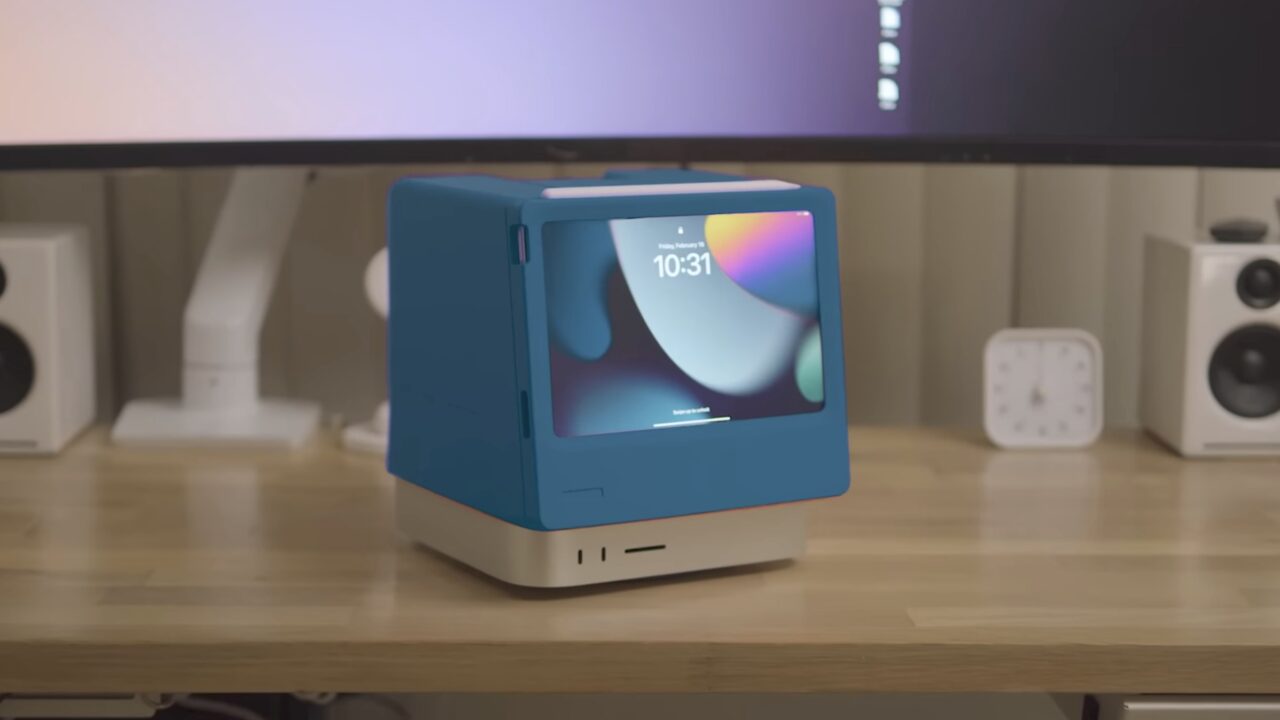
Scott Yu-Jan’s nostalgic Macintosh design pays homage to the original Macintosh, a product that helped Apple gain fame 40 years ago. This design, though seemingly a trip down memory lane, actually incorporates some of the best features of Apple’s current product design. Here’s the designing and features of the Macintosh Studio…
The 40-year-old Apple Macintosh Studio comes alive
Designed by Scott Yu-Jan, the Macintosh Studio tightly envelops the Mac Studio, with an upper structure where the iPad mini slides securely and connects to the Mac Mini via a single USB-C cable.
Thus, the iPad mini is always charged and ready as a second screen for the Mac Studio, thanks to Apple Sidecar. This setup provides a customized desktop for both devices without compromising functionality.
While quick sketches on the iPad mini are feasible, the screen’s position and angle might not be ideal for art and design work. The Apple Macintosh Studio design not only replicates the original Macintosh’s form but also adds several modern conveniences to utilize the unused space at the back.
For instance, it includes a retractable headphone holder on top and swappable drawers for a portable hard drive or a series of SSDs. Other potential designs exist, but these two manage to add value to the experience while staying within reasonable limits.

This 3D-printed structure offers flexibility in the color of the Apple Macintosh Studio. Various colors make it look like a blend of the Macintosh and colorful iMacs, bringing some life to the typically plain and somber silver aesthetic.
This innovative design offers an effective and stylish solution for both the iPad mini and Mac Studio and has made fans nostalgically wish for their own. The designer’s 3D-printed product is sure to inspire many.
What are your thoughts on this nostalgic Macintosh? Did you like the design? Share your opinions in the comments section below.


 Shiftdelete.net


