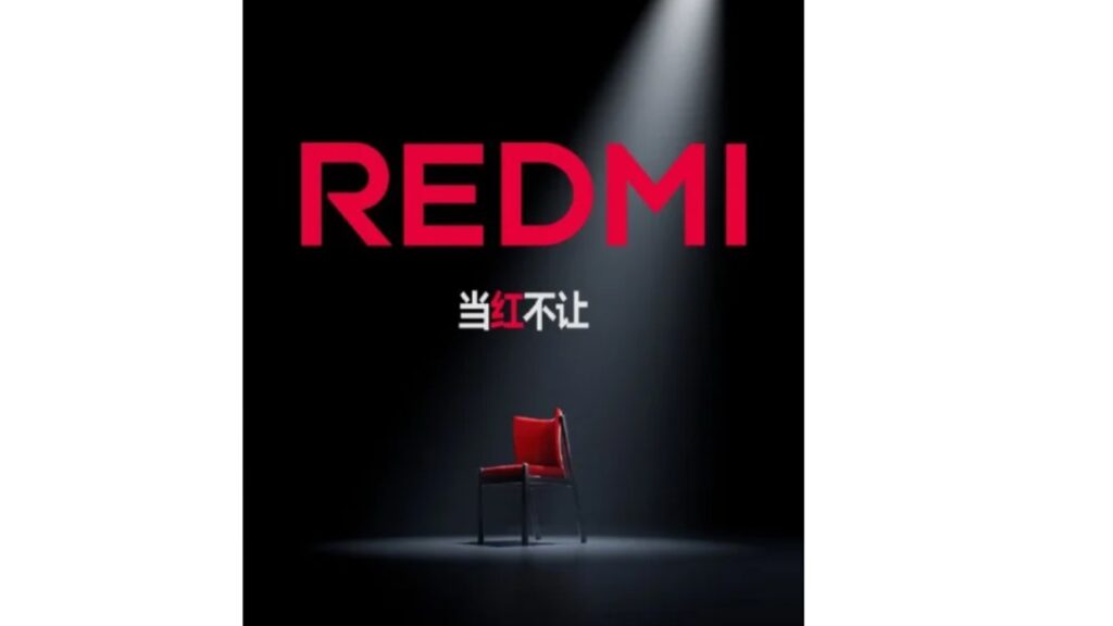
Xiaomi’s affordable brand Redmi has made a radical change and renewed its logo. Accordingly, the logo of the brand’s new products will be written in capital letters as “REDMI”.
How did the new Redmi logo come about?
The fact that the brand name is written in all capital letters as “REDMI” shows that the company has entered a new era. Xiaomi Mobile Phone President Lu Weibing said that this change is not just visual, but will reflect a deep strategic transformation.

Xiaomi’s success in the high-end phone market has allowed Redmi to expand its position and product range. Weibing stated that Redmi is ready for this transition and set out with ambitious goals.
As part of this strategic shift, Redmi is also introducing a new “Turbo” series to replace the “K” series. It has been reported that the K series will continue to raise the bar in terms of performance. The K80 series will be the biggest update in the history of the K series and will compete directly with high-end flagship models.
Redmi General Manager Wang Teng Thomas confirmed that these changes are in response to Xiaomi’s flagship series entering the higher price segment. He said that the new K series is positioned as a “flagship killer”, while the Pro series will offer “an all-around flagship experience”.
Wang emphasized that REDMI is determined to offer the best price-performance ratio and remain unrivaled in every segment it competes in, regardless of the price range. The company’s move seems to intensify competition in the smartphone market.


