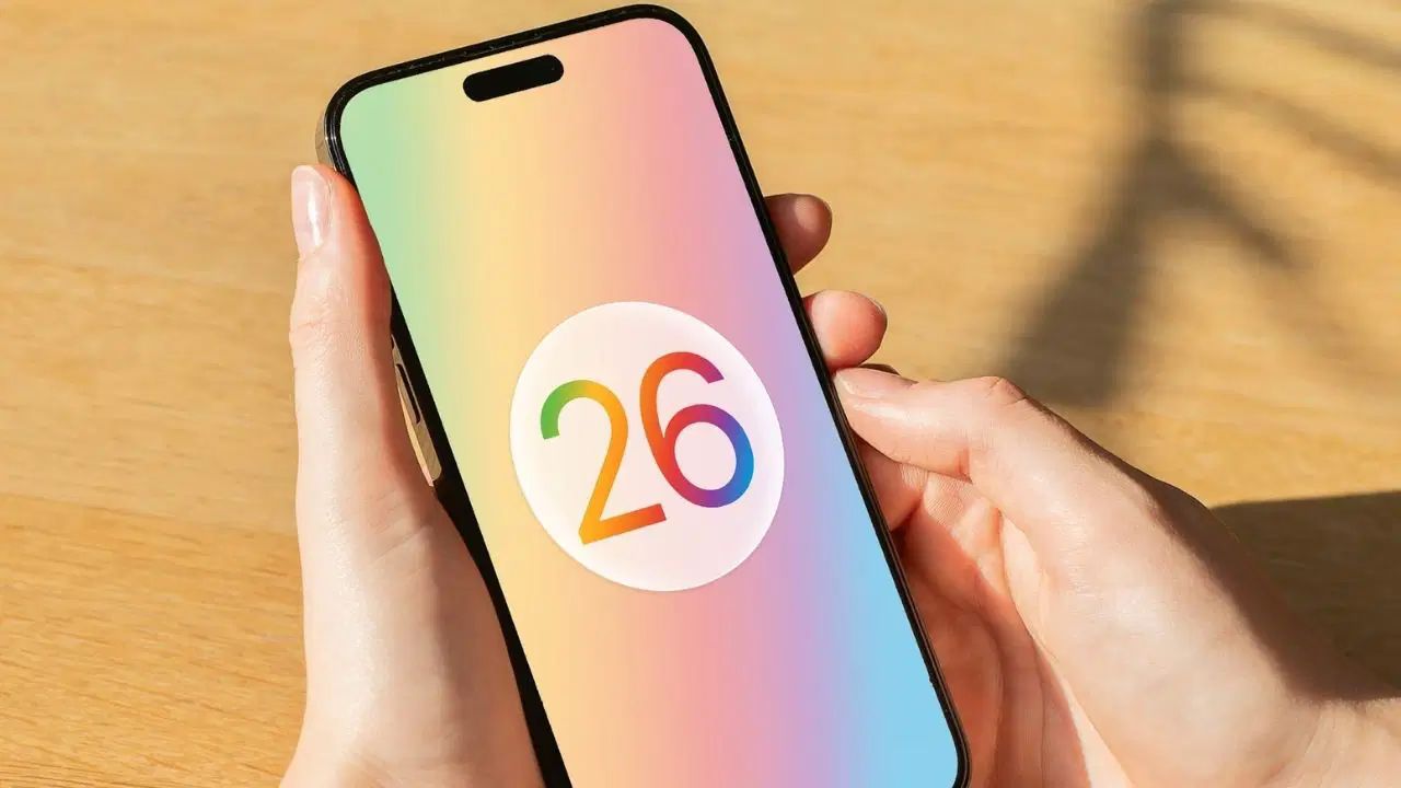
Apple is making changes to the iOS 26 design!
The Liquid Glass interface design, which Apple introduced at the WWDC event in 2024 and plans to offer to users with iOS 26, is undergoing significant changes in the developer beta process. The level of transparency in the interface has been reduced with the third beta version. Navigation bars, tabs, and buttons now have a more matte appearance. This new structure, which is visually simpler, increases readability.
Apple is making changes to the Liquid Glass interface
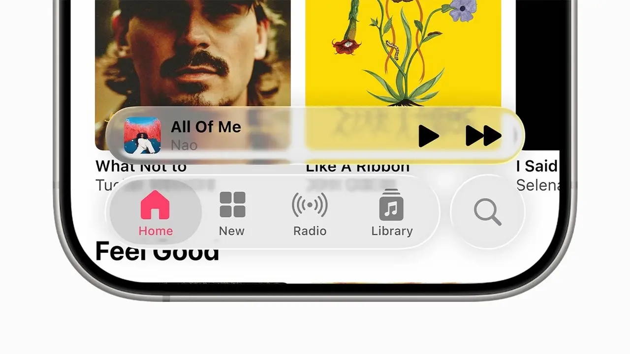
In the first beta versions, transparency was used at a level that made the user experience difficult, especially in terms of light and color contrast. Apple changed this approach by taking into account the feedback from developers and user tests. The “glassy” appearance in the interface has been made less dominant. Notification screens and navigation areas in system applications such as Apple Music are now presented with a more distinct background.
While this change is considered a positive step in terms of readability, it is interpreted by some users as a step back in terms of design. When the Liquid Glass design was first announced, the user interface emphasized liveliness, movement, and a sense of depth.
As it stands, the design has reverted to the frosted glass aesthetic seen in previous versions of iOS. While this increases functionality for some users, it also means softening the original visuals promised for others.
It seems that these changes in transparency levels are not applied equally across all apps. Apple continues to use different levels of transparency in different apps. This indicates that the design is still experimental.
It is expected that these changes in the beta version, which is currently only available to developers, will continue to evolve until the stable version. The final version of iOS 26 is scheduled to be released in September. What do you think about this? You can share your thoughts with us in the comments section below.
Your comment has been submitted,
it will be published after approval.