Exciting leaks have surfaced regarding the Android 17 notification panel, offering a first glimpse at what could be a major user interface overhaul in Google’s next mobile operating system. A long-rumored feature appears to be confirmed, showing a fundamental separation between notifications and quick settings. This redesign seems poised to reshape the user experience, particularly aiming to improve usability on large-screen phones and foldable devices.
Android 17 Notification Panel and Quick Settings to Split
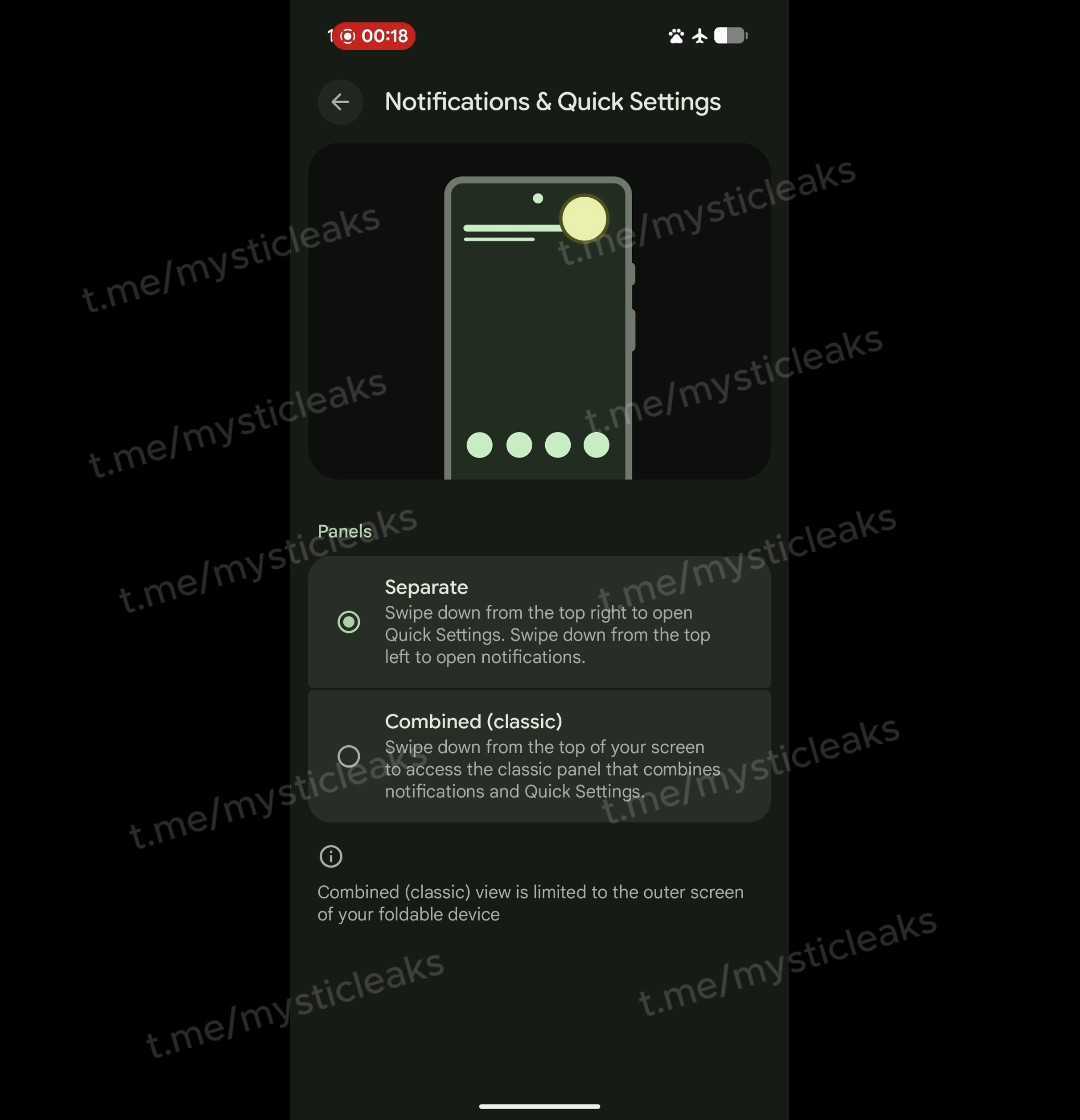
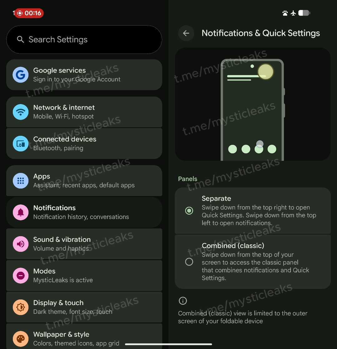
According to the leaked information, the Settings menu in Android 17 will present users with two distinct layout choices under a “Notifications & Quick Settings” section. This move suggests Google is focused on giving users more control over their interface. Depending on their habits and screen size, users can select the layout that works best for them.
The two available options will be:
- Split: In this mode, swiping down from the top-right of the screen will open the Quick Settings panel. A swipe down from the top-left will display notifications. This design is familiar to users of iOS and other Android manufacturer interfaces.
- Combined (Classic): For those who prefer the traditional layout, this option will be retained. A single swipe from the top of the screen will continue to open a unified panel containing both notifications and quick settings.
This flexibility demonstrates Google’s effort to cater to different user preferences. Furthermore, providing separate access points on larger screens could offer a significant ergonomic advantage, especially for one-handed use.
New UI Details and Visual Changes
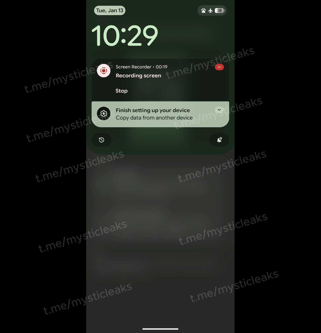
The leaks reveal more than just functional separation; they also showcase the new design of these panels. When “Split” mode is active, users can expect a visually refreshed experience. While the left-side notification panel largely resembles the current design, it features a very large and prominent clock at the top. Additionally, the date and status bar icons are enclosed in pill-shaped containers in the corners for a more modern look.
However, the biggest change comes to the Quick Settings panel. Swiping down from the right reveals a panel that no longer covers the entire screen, instead appearing as a card or sheet. This panel includes a smaller clock, carrier information, and shortcuts for editing settings, accessing the main settings menu, and the power menu. This design provides quicker access to essential controls without completely obscuring the screen, creating a more fluid feel.
One of the most notable additions is the new volume slider placed directly below the brightness slider. This means users will no longer need to use physical buttons or open a separate menu to adjust the volume, allowing for direct control from the Quick Settings panel. It is presumed that the three-dot icon next to the slider will open the full sound menu for media, alarm, and ringtone controls. This small but effective touch will likely provide significant convenience in daily use.
Focus on Foldables and Other Improvements
The leaks also indicate that this new “Split” panel layout will become the standard for the large inner screens of foldable devices. A note in the settings menu reportedly states, “The combined view is limited to your foldable’s outer screen.” This highlights Google’s commitment to optimizing the multitasking and accessibility experience on large-screen devices. Having separate areas for notifications and controls on a tablet or a foldable’s inner screen will make the interface feel more organized and user-friendly.
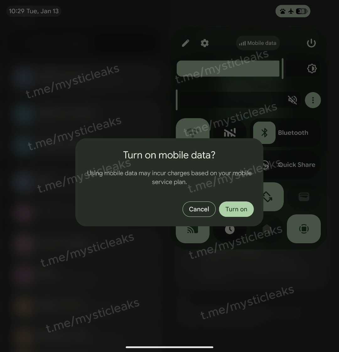
Additionally, another significant change expected with Android 17 is the return of a dedicated “Mobile Data” Quick Settings toggle. In previous Android versions, Wi-Fi and mobile data were merged into a single “Internet” button, which drew criticism from many users. According to the leaks, Google has listened to this feedback and is bringing back a separate Mobile Data toggle with a cellular bars icon and a classic Wi-Fi toggle. This will allow users to manage their internet connections more quickly and intuitively.
In conclusion, these initial leaks for Android 17 suggest that Google is working on substantial visual and functional improvements. Changes like the separation of the notification panel and Quick Settings, the new volume control, and the dedicated mobile data button have the potential to make the Android experience more customizable, efficient, and modern. We will have to wait for the official announcements to see if these features make it into the final release.
So, what are your thoughts on the new Android 17 interface? Share your opinions with us in the comments!