
Chibi-Robo!: Park Patrol Box Art Battle Gets Nostalgic

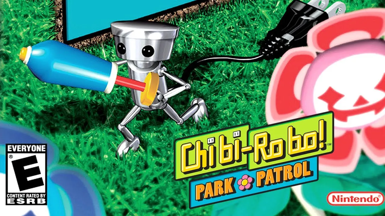
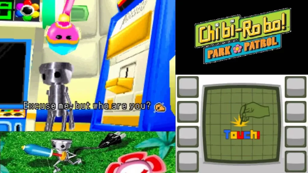
To celebrate Chibi-Robo!: Park Patrol arriving on Nintendo Switch Online, fans are revisiting this underappreciated DS classic and choosing a favorite between two wildly different box art designs.
Chibi-Robo!: Park Patrol was never released in Europe, which leaves just two contenders in this visual duel: the North American and Japanese versions. Each cover tells its own story about the eco-friendly, garden-tending robot hero.
North America’s cover shows chaotic charm
The US version leans into action. Chibi-Robo bolts across a grassy field, water blaster ready, surrounded by oversized flora and a dramatic sky. The bold yellow logo practically screams from the top of the box, while an eerie foreground gives it a surreal twist.
It’s loud, expressive, and fully committed to the “tiny robot in a big world” theme.
Yooka-Replaylee Heads to Switch 2 With Full Cartridge Release
Japan’s take on Chibi-Robo!: Park Patrol is clean and quiet
Japan swung the pendulum the other way. Instead of noise, it offers minimalism. A white background, subtle sketches of flowers, and a subdued logo at the bottom. Chibi-Robo stands still, almost reflective, with only a light patch of grass beneath him.
The entire presentation feels meditative and oddly soothing.
Key differences at a glance
Here’s how the two stack up:
- Style: Bold vs. Minimalist
- Focus: Action scene vs. Stationary portrait
- Logo placement: Top-heavy vs. Bottom-balanced
- Color usage: Saturated greens vs. soft whites
Which Chibi-Robo!: Park Patrol art wins?
Now it’s your turn to weigh in. Does North America’s energetic vibe win the day, or does Japan’s quiet confidence come out on top?
Your comment has been submitted,
it will be published after approval.