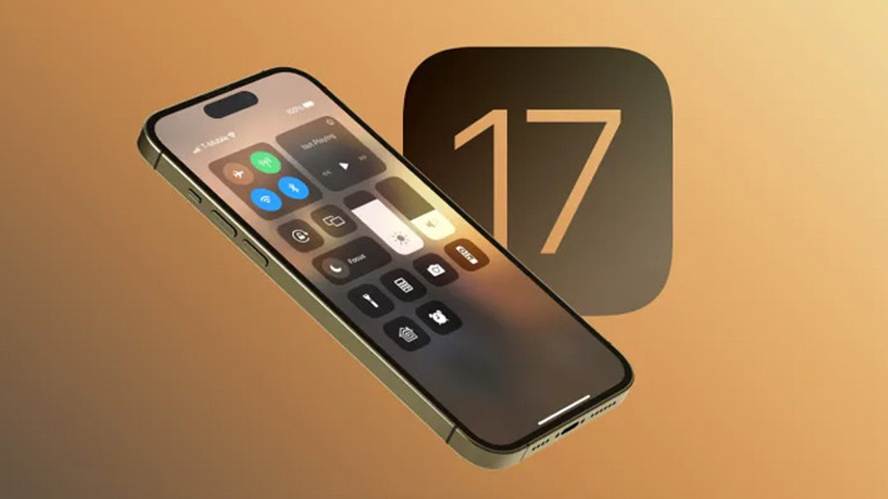
Apple has been tweaking the iOS interface for years. The biggest innovation to the operating system recently has been support for widgets. However, a designer points to an important change in iOS 17. iOS 17 concept revealed how the Control Center will look like a list.
Control Center redesigned with iOS 17 concept
A new concept for iOS 17 shows what a new Control Center would look like on iPhone. The work by designer Parker Ortolani transforms Control Center into a customizable list of colorful icons and labeled controls.
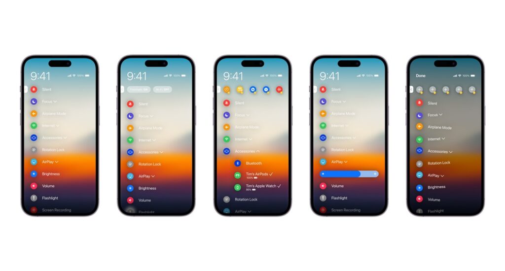
The new iOS concept allows users to organize and sort controls without having to go into Settings. For example, frequently used functions can be pinned to the top of the list for easy access.
System functions such as Wi-Fi, Bluetooth, flashlight and third-party application software can be controlled from this screen. For example, you can see the weather or ask ChatGPT a question.
The designer also didn’t rule out a new “Action” button, rumored to be coming with the iPhone 15 Pro. The concept suggests that the side button could be used to quickly open the redesigned Control Center.
Apple first rolled out Control Center in 2013 with iOS 7 and updated it as part of iOS 11, which is available with iPhone X. The current design requires swiping down from the top right corner of the screen to see controls like airplane mode, Do Not Disturb, screen brightness and media playback.
It should be noted that iOS 17 will be introduced with iPhone 15 in September.


