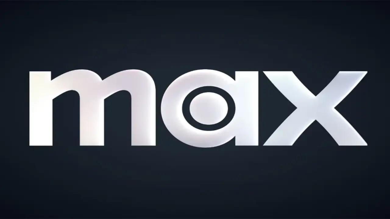
Warner Bros. Discovery’s digital streaming platform Max has renewed its logo and color palette, switching to a black-and-white design. Formerly known as HBO Max, the platform has adopted an aesthetic similar to the visual identity used by HBO for many years with this change.
Digital streaming platform Max has changed its logo
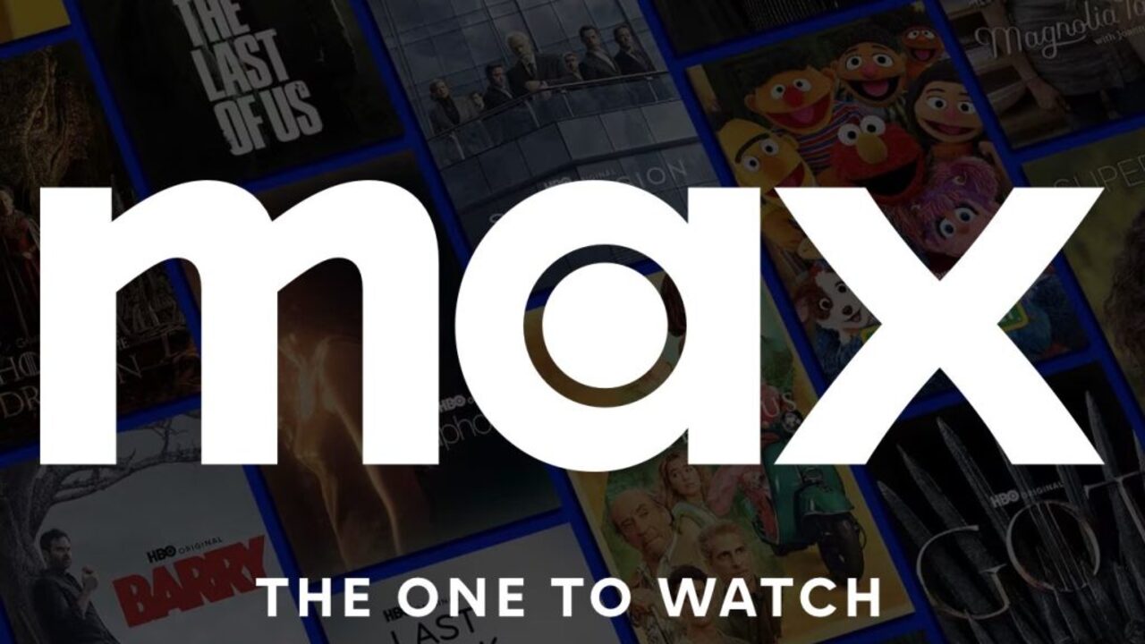
The renewed design is visible in the user interface and has also been updated on its social media accounts. The company will also use this new design in its marketing materials in the coming months.
Max’s new look visually makes its connection with HBO more obvious, while also reminiscent of the aesthetic preferences of platforms that mainly appeal to mature audiences, such as Apple TV+. While Warner Bros. Discovery has not made an official statement on the subject, no comment has been made on whether the change was a conscious choice.
The platform, which was launched as HBO Max in 2020, was introduced with a purple color palette at the time. However, in 2022, with Warner Bros. leaving AT&T and merging with Discovery, the platform’s name was shortened to Max and its colors changed from purple to blue.
By choosing the name Max, Warner Bros. Discovery aims to emphasize that it has a wide range of broadcasting options that include not only HBO’s prestigious series but also Discovery+ content. At the time, company CEO David Zaslav stated that this change was made to show that viewers of all ages can find content suitable for themselves on the platform.
In addition, in the statements made about the blue color preference, it was stated that this is one of the most liked colors globally. However, since blue is a common choice among digital broadcasting platforms, Max has gained a similar appearance to its competitors such as Disney+, Paramount+ and Amazon Prime Video in this field.
The renewed black and white design is interpreted as an effort to clarify the platform’s visual identity. So what do you think about this? You can share your opinions with us in the comments section below.