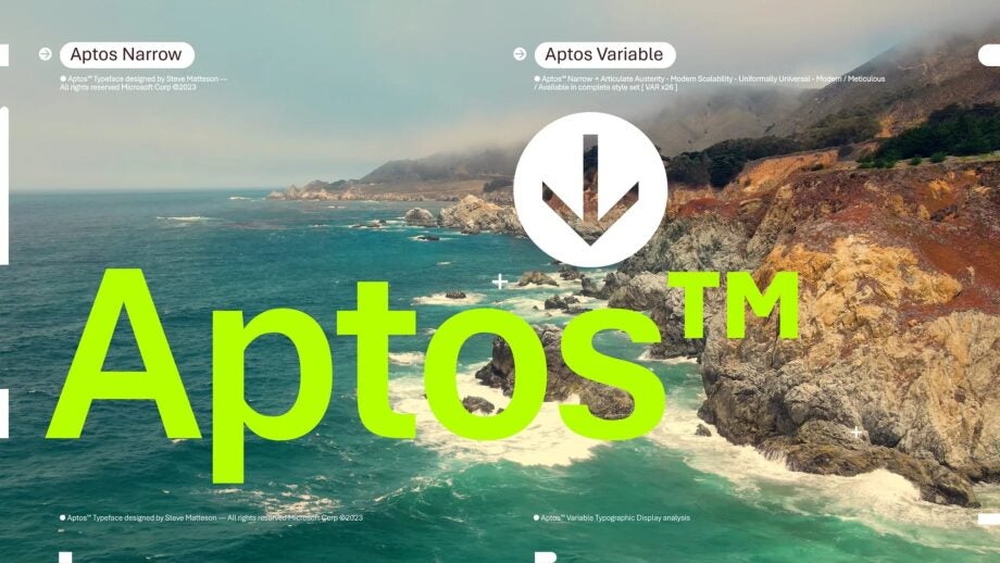
Office tools, which are used in all areas where computers are widespread, have been using a classic font for 15 years. After studies carried out by Microsoft, it was announced that the new font for Office had been determined. As a result, Microsoft Office will now use the Aptos font instead of Calibri.
Calibri is out for Office, Aptos is in
After 15 years as the default font in Microsoft Office, Calibri is being replaced by a new font called Aptos. Inspired by the Segoe typeface family, Aptos is known for its sans serif style. According to Microsoft, the new font is more modern and easier to read than Calibri.

Aptos is particularly notable for its smaller size. The company revealed that it has a wider range of styles (italic, bold, thin, etc.). This means that users can choose different fonts for different tasks.
For example, the bold version of Aptos can be used for headings. The regular style can be used for general text. This makes Aptos more versatile than Calibri, which only has two versions.
As well as being more readable, Aptos is also said to be more inclusive. According to Microsoft, the letterforms in Aptos have more uniform shapes. This will make it easier for people with dyslexia to read.
The tech giant will add Aptos as a default font in Microsoft 365 applications in the coming months. It should be noted, however, that the Calibri font will still be available, and users will be able to revert to the old font if they wish.


