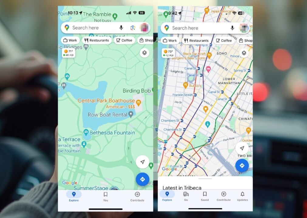
Google Maps is being revamped with a simpler and cleaner design for iPhone users. With this update, which was noticed by analysts, the options in the bottom bar of the application have been reduced from five to three. The previous version included tabs such as Explore, Go, Saved, Contribute and Updates. In the new version, however, only Explore, You and Contribute are available in the bottom bar. Here are the details…
Google Maps iPhone app now has a simpler look
In this new organization, the Saved and Updates tabs have been merged under the “You” tab. Now, when you tap on the “You” tab, you will be able to see your saved trips, notifications and messages from Google. This redesign was released for iOS with version number 6.129.1.
The new simplified look of the Google Maps app for iPhone users aims to provide a more organized and user-friendly experience. Android users received this redesign in late July. In addition to the new design, there are also new features such as a tool that shows where you can park at your destination and a larger icon for reporting incidents.
For iPhone users, this simplified look is considered a welcome update for the popular navigation app. A large portion of Apple users used to prefer the Google Maps app due to the Apple Maps app’s lagging behind in terms of usability, but Apple Maps has also made serious improvements recently.
However, Google’s Waze is still a good alternative for users who prefer gamification features. What do you think about this new design? Which map app do you use? Share your comments in the space below!


