Google is continuing to refine its user experience across apps, and this time, it’s Google Photos receiving a welcome update. The latest version of the app introduces a redesigned photo viewer that emphasizes clarity, quick access to photo details, and a simplified interface.
A Clearer Way to View Photo Details
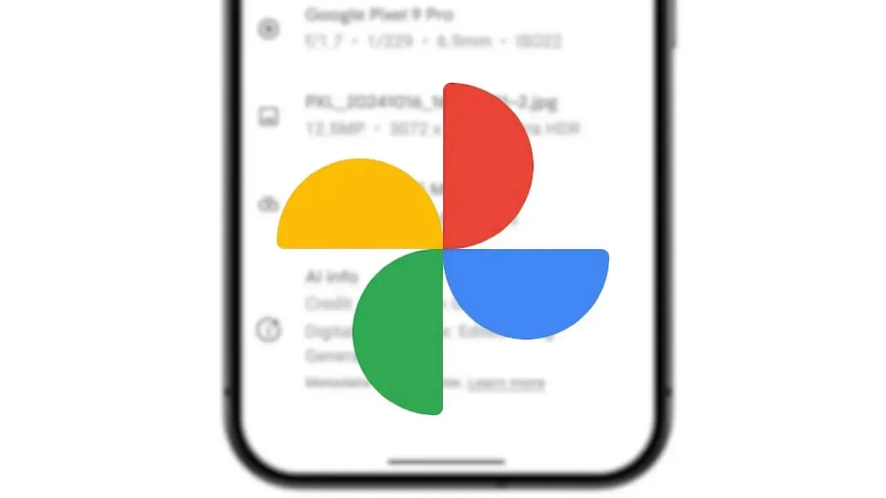
Previously, users had to dig through menus to find essential image metadata. Now, the new interface places key information, such as date, time, and location, right at the top of each photo. This streamlines the process and makes metadata instantly visible without compromising Google Photos’s clean design.

Vivo Y500 leaks point to an 8,200 mAh battery, Dimensity 7300 chip, and AMOLED display, making it Vivo’s biggest-battery phone yet.
Google Photos Interface Enhancements and Functional Changes
Alongside the metadata shift, Google has removed the bottom photo carousel, decluttering the photo view and giving images more space to breathe. Google Photos’s new light background theme has also been introduced, offering a visually lighter aesthetic that aligns with Google’s broader Material You design approach.
In the bottom of Google Photos’s menu, the Lens button has been replaced with a more versatile ‘Add to’ option, providing users with quicker ways to organize their photos. Meanwhile, the Edit icon has been visually simplified, although its functionality remains unchanged.
Why These Small Changes Matter
While these tweaks may seem minor, they’re part of Google’s larger effort to unify app design under Material 3 Expressive. This consistent visual language across Google’s ecosystem improves usability and makes the apps feel more modern and intuitive.
If you haven’t updated yet, the new look is already available via the Google Play Store. For those curious but hesitant to install the Google Photos update, preview screenshots of the redesign are also available online.