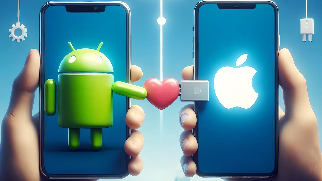
There is an exciting development for Google Android users. The famous company is preparing to make a significant design change in its popular Phone app. With the new update to the Phone app, the call answering screen on Android will look very, very similar to the classic screen of Apple iPhone devices on iOS.
Android users may not like this feature!
As you know, for a long time, you have to swipe up to answer incoming calls on Android devices and swipe down to reject them. However, this method can be a bit confusing, especially for users who are used to iPhone or Samsung phones. Google is preparing to take a big step to solve this problem and improve the user experience.
The new interface, which is being tested in the Google Phone app update number 145.0.672690850, completely changes the incoming call screen. In the new design, there are separate buttons for answering and rejecting calls, just like on iPhones. The green ‘Answer’ button is on the right side of the screen, while the red ‘Reject’ button is on the left.
This color coding added by Google will make it easier for users to react quickly and accurately, especially in hectic moments. In addition, the placement of the buttons has also been ergonomically considered; the ‘Reply’ button is more accessible for right-handed phone users.
Another striking feature of the new interface is the ‘Message’ option. This button will allow you to quickly send a message when you can’t answer an incoming call. This way, you will be able to respond to incoming calls instantly when you are in a meeting or driving.
Google’s move is seen as an important step towards reducing the difference in user experience between Android and iOS. This change will be especially useful for users who switch between different operating systems.
However, like any innovation, this may be met with different reactions among users. Giving up the swipe gesture that has been used for years may be challenging for some users. In addition, the fact that the operating system is becoming more and more like iOS with small little details may annoy users…
In this sense, it is curious how Google will manage this transition process. Do not forget to share your opinions about the new interface with us in the comments.


