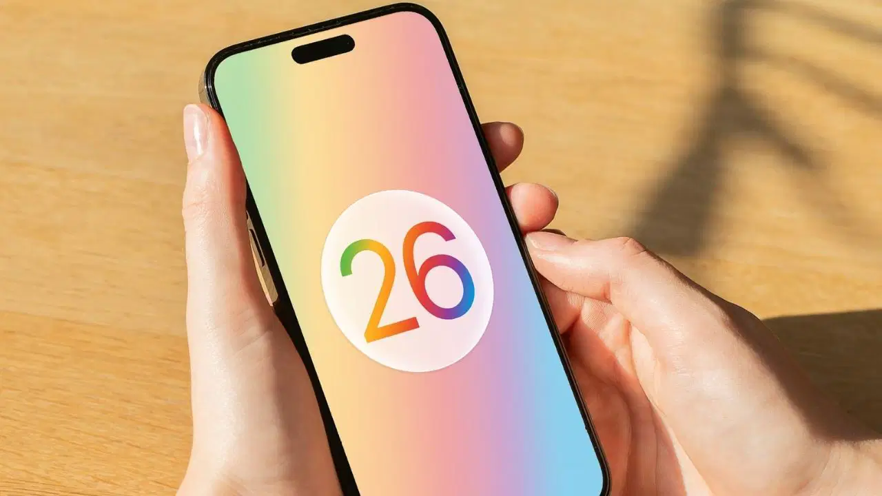
Apple’s iOS 26 update brought with it the first complaints along with its new design features. Users are reporting that the new design, called “Liquid Glass,” creates an optical illusion in app icons, making them appear crooked.
Do apps appear crooked in iOS 26?
The “Liquid Glass” effect introduced in iOS 26 adds a slight glass-like glow to the corners of app icons. However, this aesthetic choice creates an optical illusion that makes the icons appear crooked for some users. Complaints indicate that this crooked appearance has caused some users to experience issues such as dizziness and disorientation.
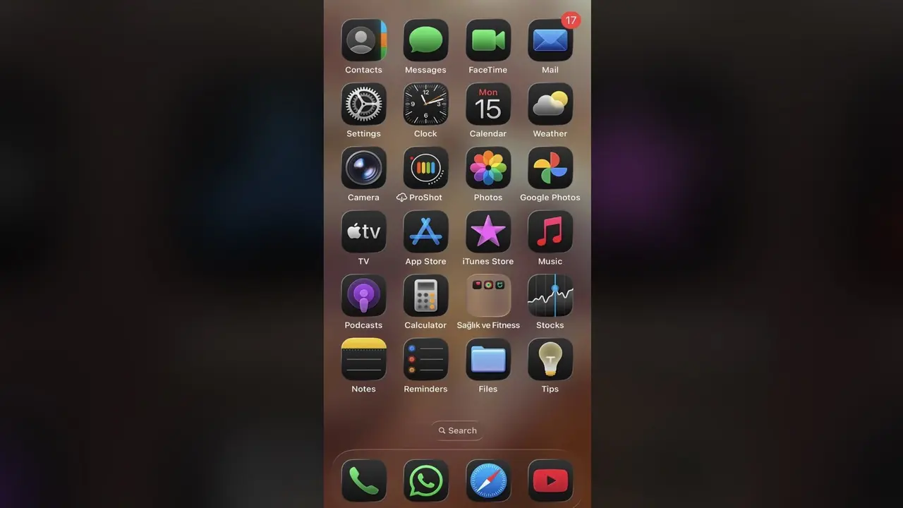
This is particularly noticeable on black backgrounds. Users report that the crookedness is more noticeable when the background is black and the icons are set to dark or light colors. This effect is reported to be less noticeable when colorful wallpapers are used.
Apple’s accessibility settings, such as “Reduce Transparency” and “Reduce Motion,” offered in previous versions, don’t address this issue. Users expect Apple to add a dedicated setting to control this optical illusion in a future update.
So, what are your thoughts on this? Share your thoughts with us in the comments below.