Apple will introduce a new design language inspired by visionOS with iOS 26, macOS 26, tvOS 26, and watchOS 26. Rumors and leaks ahead of WWDC 2025 show which design elements Apple will take from its latest operating system, visionOS.
6 key changes to the “Solarium” project code
Within Apple, the iOS 26 redesign project is known by the code name “Solarium.” Solarium is basically a completely glass room designed to let in a lot of light.
Transparency
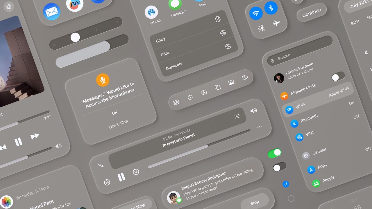
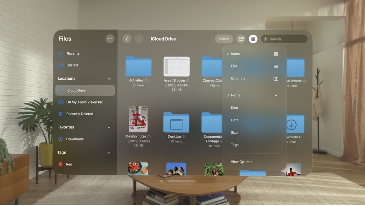
Since the launch of visionOS, menus and interface elements have been translucent because people in an AR/VR environment need to be able to see as much of their surroundings as possible in order to feel immersed. Translucent design elements in visionOS blend in better with the background, creating a subtle look and allowing real-world color and light to blend in. It’s not hard to imagine how this kind of translucent design could work in apps like Photos.
Floating menus and navigation bars come with transparency. In visionOS, everything floats in open space around you, whether you’re viewing your surroundings through a camera or a VR background. In iOS 26, Apple could replicate this effect with shading and shadowing, creating a soft, blurry depth effect by making interface elements appear slightly elevated above the background content. visionOS heavily uses top-aligned toolbars instead of bottom bars, so it’s possible that iOS could move in that direction as well.
Rounded buttons and interface elements
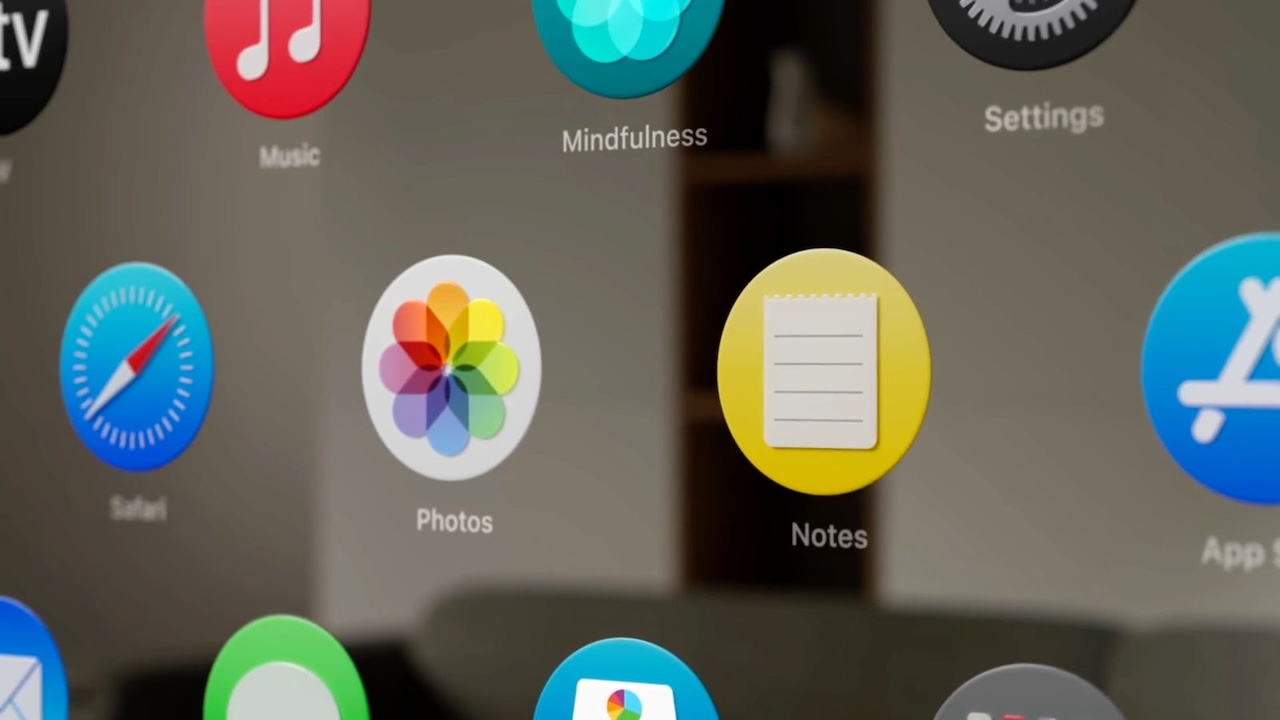
iOS already uses rounded squares and rounded rectangles for icons, notifications, menus within apps, search bars, and all the card-style interfaces we’re used to, but visionOS is even more rounded. The floating navigation bars in iOS can be pill-shaped with sharper rounded edges. visionOS also uses more dramatic rounding at the corners, and app icons are completely rounded. iOS 26 could be rounder overall, and could be closer to some of the shapes in visionOS. Leaker Jon Prosser has claimed that there will be an option for rounded app icons, but it’s unclear whether Apple wants to go in that direction for iOS, as Android has long used rounded app icons. The iconic squircle is one of the many design features that sets iOS apart from Android.
Glass look
With its transparency, the visionOS interface can almost look like frosted glass. Apple’s WWDC 2025 design features a rainbow of frosted glass in varying pastel colors, perhaps a hint at plans to adopt a frosted, sea glass-style look that’s not too far removed from what we already have in visionOS. visionOS actually uses a system-designed material that Apple calls glass for app windows. It allows surrounding light, virtual content, and objects to show through menus and windows. The glass adapts to the background color and provides contrast for app content, while also taking into account people’s physical surroundings. Apple may use a similar material design in iOS 26.
Subtle lighting changes
Translucent interface elements in visionOS can interact with the lighting conditions in the room the user is in. This doesn’t translate to the iPhone, but iOS will apparently have some subtle lighting effects that will emphasize the transparency and glass-like design. In visionOS, windows also cast shadows that are sensitive to head movement. This doesn’t translate to iOS, but changing lighting and shadow effects as you move your iPhone is a possibility. In fact, Prosser claims that the Flashlight and Camera (or customized) buttons on the Lock Screen glow as you move the iPhone. Apple could use dynamic shading in apps and widgets, and adaptive color could add to the effect by allowing interface elements to blend in with the wallpaper and change with ambient light.
Simplicity
For the most part, visionOS features a simplified design across Apple apps, giving it a more airy feel due to the space needed to ensure people have enough space to look at a button to interact with it. iOS 26 could adopt streamlined navigation and menu elements for a less cluttered look. visionOS uses cleaner fonts, bolder text, and increased line height, which may or may not translate to iOS.
Apple is likely taking a hard look at navigation, menu options, and layout, as analysts say one of the main aspects of the redesign is greater cross-platform compatibility. Analysts say iOS 26 will be “simpler to use, faster to navigate, and easier to learn.”
It’s not just iOS 26 that’s getting an overhaul. There are visual changes to menus, buttons, and navigation. The changes and tweaks will also extend to macOS 26 and, of course, iPadOS 26. watchOS 26 and tvOS 26 will also see design updates.
Apple will undoubtedly provide developers with new design guidelines and resources to extend the updated look to third-party apps.