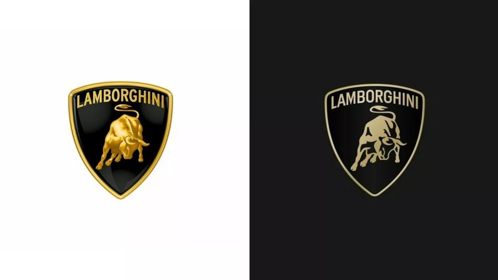
Lamborghini has revamped its iconic logo as part of a brand overhaul. The automotive giant switched to a much simplified logo, making the 3D drawing 2D. The classic bull was designed in a simpler way.
The new Lamborghini logo will be much simpler
The reflections and textures of the old logo were removed and a clean lettering was adopted. On the other hand, the new Lamborghini logo adopts a black and white color scheme with gold and yellow accents. This keeps the brand in line with today’s design trends.

Lamborghini announced that the renewed logo will be used across the model range and digital platforms in the future. It is expected to first appear on the new Huracan model to be launched in the coming months. Other vehicles such as the Aventador and Urus SUV will also be updated with the new logo over time.
With this update, Lamborghini’s corporate logo has been redesigned for the first time in over 20 years. It also reflects the brand’s new strategy focusing on electrification, sustainability and an “authentic” image.
Lamborghini plans to update its entire product range to hybrid and electric from this year. The company also plans to offer fully electric models by 2028.
Simplified but with a classic feel, the new logo also represents Lamborghini’s transition of the brand into the electric future.


