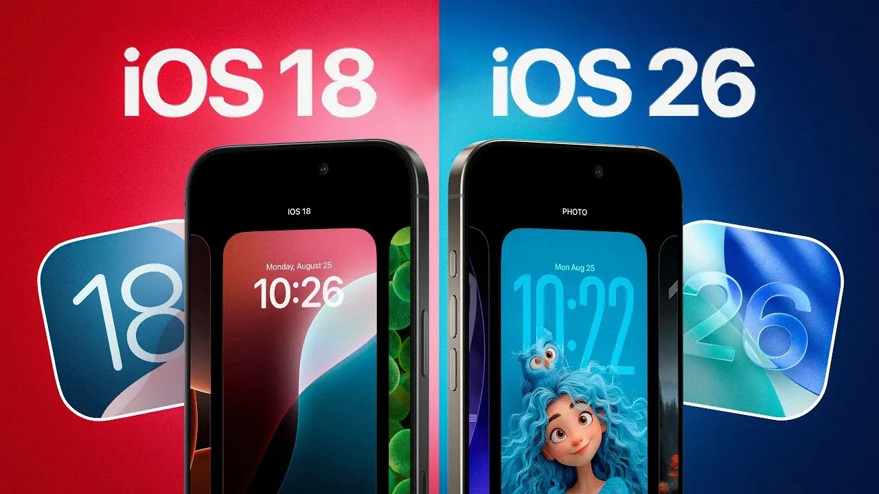
Apple’s latest major update to iPhones, iOS 26, attracted attention with its radical new design language called Liquid Glass. However, this new, transparent, and fluid interface has divided users on social media. If you’re struggling with the new aesthetic or experiencing readability issues, don’t worry. With a simple setting Apple has tucked deep into the system, you can make the interface more similar to the more familiar iOS 18.
Liquid Glass, Apple’s new design philosophy across all its devices, adds greater transparency and a sense of layered depth to interface elements. While some users appreciate this modern and stylish look, many complain that text readability is reduced and the new design is eye-straining. Fortunately, while Apple doesn’t offer a way to disable this design entirely, it does offer a solution that significantly reduces its impact.
You can compare iOS 26 to iOS 18
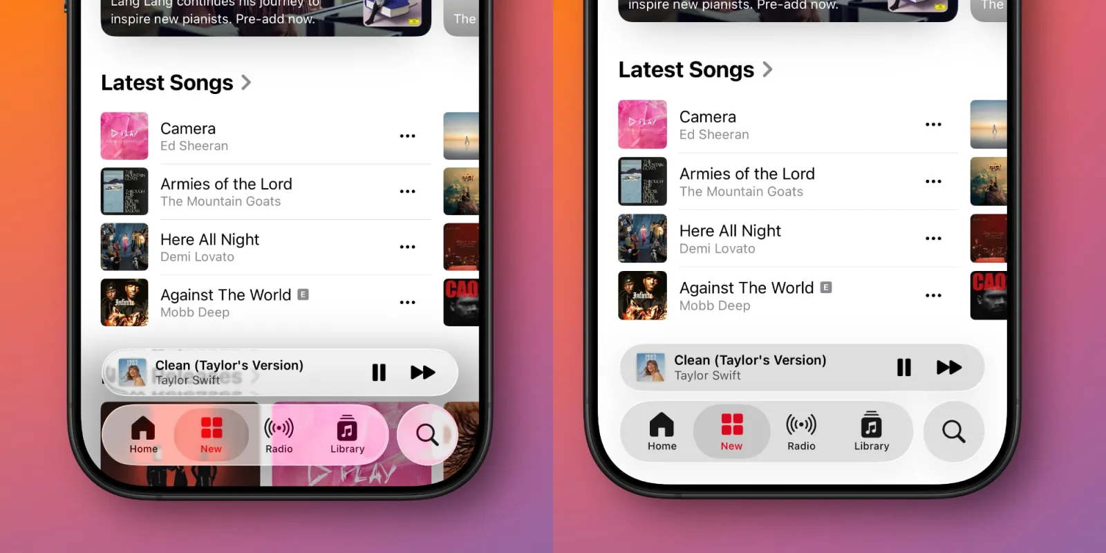
For users who dislike the new design or need higher contrast, the solution lies in an accessibility setting called Reduce Transparency. This setting, as its name suggests, largely eliminates the transparent and blurry layers that form the foundation of the Liquid Glass design.
As a result, text and icons become more distinct, the overall contrast increases, and the interface feels much closer to the flatter and more opaque design of iOS 18.
To activate this feature, simply follow these steps:
- Open the Settings app on your iPhone.
- Go to the Accessibility menu.
- Tap Display & Text Size.
- Turn the “Reduce Transparency” switch on.
Toggling this simple setting will leave the other design improvements introduced in iOS 26 intact, but at least you can get rid of the overpowering, transparent effect of Liquid Glass and return to a more familiar and readable iPhone experience.