Mazda has decided to refresh its logo after 28 years, making a significant change in its brand identity. The Japanese automaker has officially unveiled a new logo with a flat and minimalist design. This new logo is part of Mazda’s goal to create a brand identity that aligns better with the digital world, and it marks the final step in a change that has been discussed since July of the previous year. Here are the details!
Why Did Mazda Make This Change?
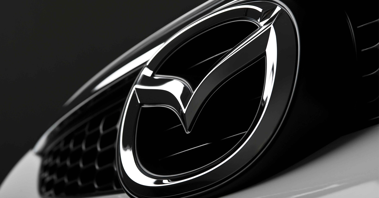
Mazda’s new logo is a part of the company’s modernization and digitalization process. The ‘M’ symbol, which has become synonymous with the brand, and the curved, gull-wing shape are preserved, but the new design adopts a flatter, simpler, and shadowless style. The logo, optimized for smartphones, tablets, and digital screens, now features cleaner and sharper lines.
The company’s previous logo was introduced in 1997 and was considered a design that reinforced Mazda’s premium image. However, like many major automotive brands, Mazda decided to simplify its logo. Large manufacturers such as Audi, BMW, Volkswagen, and Nissan have also opted for flatter, two-dimensional logos in recent years.

Steam announced the best sellers between 21 January - 28 January 2025. The popular story game made the list.
This significant change coincides with Mazda’s 105th anniversary, which marks the company’s founding date of January 30, 1920. According to Japanese media reports, Mazda views this change as part of its celebration and an effort to further advance its brand identity.
While Mazda’s new logo is now being used across digital platforms and marketing materials, it’s not yet clear whether the physical logos on cars will also be updated. However, it has been noted that the 2024 Mazda EZ-6 sedan model features a shadowless and illuminated version of the new logo, suggesting that the new logo may soon appear on cars as well.
What do you think of Mazda’s new logo? Do you think it’s the right move for the brand’s identity? Feel free to share your thoughts!