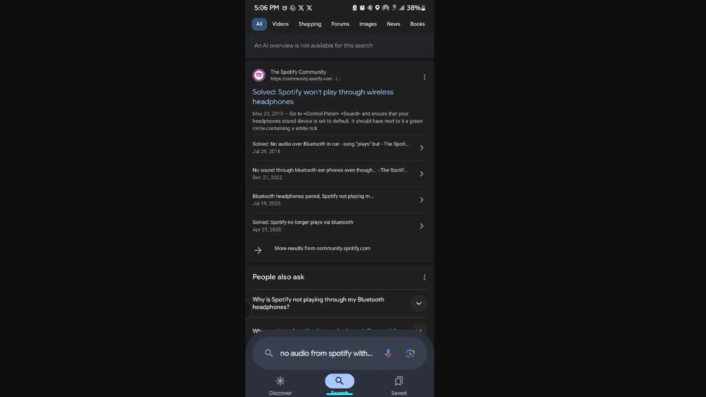
Google is preparing a series of changes to the design of its Android app. It turns out that the company is accelerating work on new designs, including a lower navigation bar during search. So how will the bottom navigation bar work?
New bottom navigation bar for Google Search app
The Google app plays a very important role for search on Android phones. We even know that it is the default search on many devices. So users have long been used to having the search bar at the top of the screen. However, Google may want to move the search bar down.

In the latest test version of the Google app, it was revealed that the search bar will now be part of the bottom navigation bar. It will be located just above the Explore, Search and Saved tabs.
Google’s move to the bottom bar is not surprising. As the screen size of smartphones continues to increase, it becomes harder to reach the top elements. The bottom bar seems to facilitate both one-handed use and general use.
In addition, the tabs in the test version also get a new look. In line with the Material You design that the company uses in its own services, tabs appear to be inside pill-shaped tiles.
Google is actively testing these changes. However, if officially rolled out, the bottom bar seems to make search and navigation more convenient for Android.
So what do you think about this issue? Don’t forget to share your opinions with us in the comments section!


