Apple’s Photos app is getting some polish in iOS 26. After last year’s drastic redesign in iOS 18, this year’s update brings a blend of useful changes and welcome course corrections. From design tweaks to smarter navigation and new visual tricks, the app continues to evolve — this time with a softer touch.
Photos app now uses Apple’s Liquid Glass design
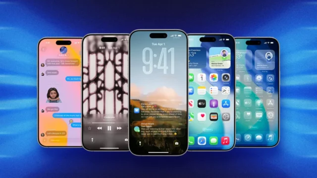
One of the most noticeable updates across iOS 26 is the new Liquid Glass look. In the Photos app, you will see this new style across buttons, tabs, and menu sheets. It brings a smooth, light-blurred finish to interface elements, making everything feel more fluid without distracting from your photos.
Compared to other stock apps, Photos gets a lighter dose of this design since the visuals are meant to stay out of the way. Still, it is a visible shift and adds a bit of depth to the UI.
iOS 26 has become the most downloaded developer beta ever. This surprised many. Here are the details about the update.
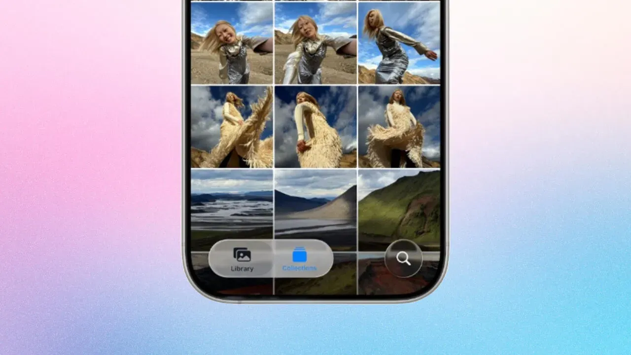
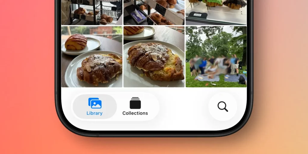
Tab bar returns to the Photos app

When Apple removed the tab bar in iOS 18, users were not thrilled. That single-screen layout confused longtime iPhone owners. With iOS 26, Apple is bringing the bottom tab bar back to Photos.
This time, it features three tabs:
- Library, for viewing your full photo roll
- Collections, with customizable sections
- Search, for finding people, places, or keywords
It is not exactly the same setup from before iOS 18, but it feels more familiar and easier to navigate.
iPhone can now spatialize your photos
First introduced in visionOS, spatial photos are now coming to iOS. In the Photos app, a new icon in the top-right corner lets you view any image as a Spatial Scene. This adds depth to the image, letting you tilt and pan to see it from different angles.
The effect is fun in the app, but it works best as a Lock Screen wallpaper. It brings a little motion to still photos without needing a full video.
Photos app gets better customization in iOS 26
Apple has also expanded how much control users have over the Collections tab. Last year, you could already reorder sections. Now, iOS 26 adds new view settings and the ability to hide or collapse parts of the page.
Tap the three dots at the top of Collections and you will find three display modes. You can make all sections the same size, all small, or keep the default mixed layout. For anyone with dozens of albums or smart folders, this can make browsing a lot easier.
You can also temporarily collapse any collection to reduce clutter and focus on what matters.
Photos app in iOS 26 feels smarter without overdoing it
Apple is not reinventing the wheel this time. After the big shift in iOS 18, this update brings calm. The interface looks better, the tabs work better, and features like Spatial Scenes add just enough surprise to keep things interesting.
It is not flashy, but it is cleaner. And right now, that might be exactly what the Photos app needed.
Some apps move fast and break things. This one just moved back into focus.