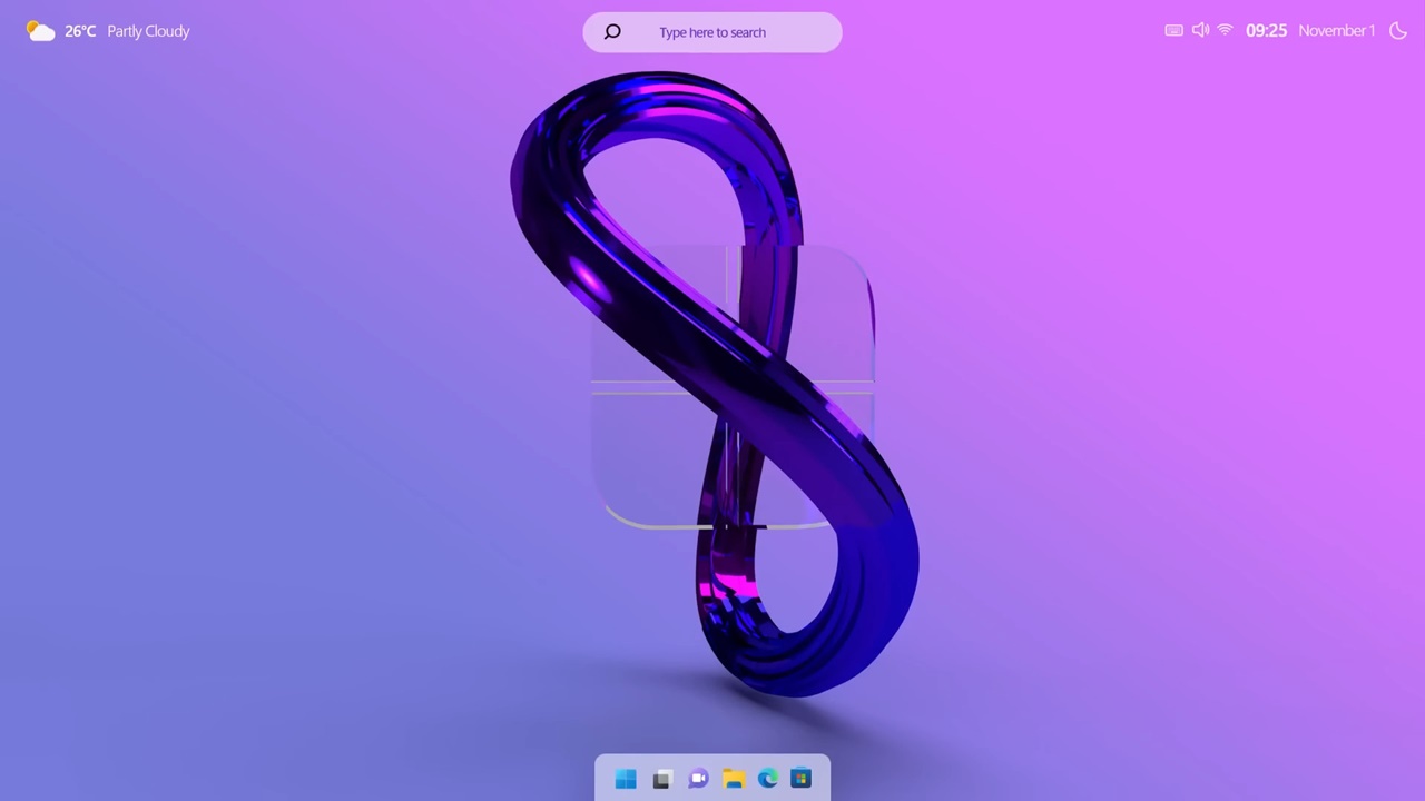
Microsoft unveiled Windows 11 about two years ago and is trying to get users on board with the operating system. Presented as the most important upgrade ever, Windows 11 received mixed reviews from users. Against this backdrop, users have been conducting studies that show how Windows 12 should be. Here is the dazzling concept of Windows 12 with its dark mode.
Windows 12 concept reveals redesigned start menu and widget dashboard
Expectations are rising for Microsoft’s next-generation operating system. Conceptual designers with their own ideas on the subject discuss the improvements and new features to be found in Windows. Finally, a video created by a YouTuber has revealed Windows 12.
The concept video retains the rounded corner design introduced in Windows 11. It draws attention to the redesigned Start menu and Widget Board in Windows 11. The Start menu will feature a “Recent Items” section instead of the current “Recommended Content”, giving users a more practical experience.
The widget dashboard is similar to the tiles in Windows 10. It emphasises that Windows 12 should offer the ability to rearrange widgets freely for personalisation. The transitions between light and dark themes are also very elegant.
In addition to the Start menu and widget dashboard, there are several features on display that are expected to be available in Windows 12. File Explorer, Tabbed Notepad and Microsoft Store continue the lines of Windows 11 and Windows 10.
What do you think? Let us know what you think in the comments section.


 Shiftdelete.net

