WhatsApp has been working on changing its Android design for some time. The latest leaked images reveal a complete overhaul of the popular messaging application. The platform is planning to move the buttons to the bottom, similar to iOS, and also adopt Google’s Material You design.
WhatsApp’s Android app design changes with a major overhaul
According to reports from WABetaInfo, the update is currently in development and not yet available for beta testing. WhatsApp aims to make its interface compatible with the Material You 3 design. The first step is to redesign the buttons in the Android version. The buttons will allow users to easily start a new chat and access all WhatsApp contacts.
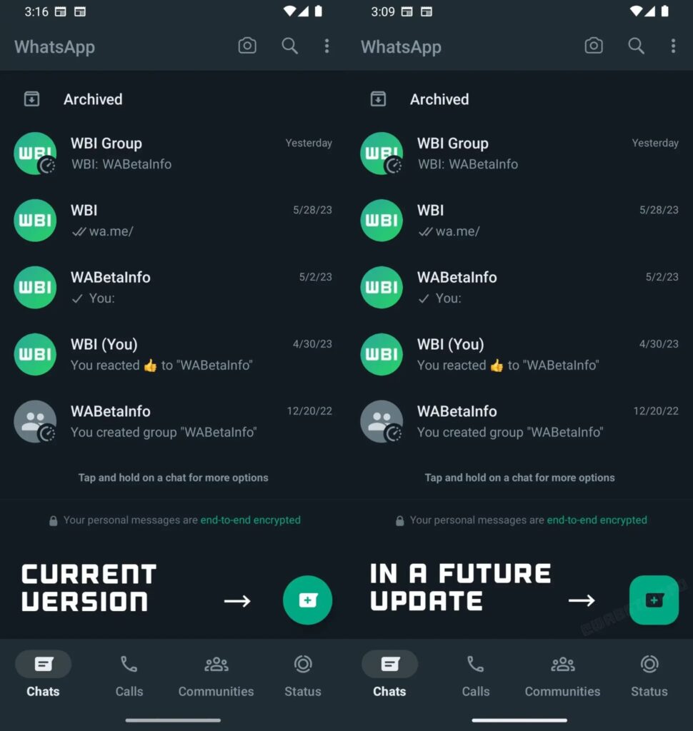
With the implementation of Material Design 3, there will be significant changes to the buttons. The “Call” button under the Calls tab and the buttons in the Status tab will undergo a design change. Currently circular, these buttons will have a more squared look.
Additionally, there will be changes to the overall interface. One notable change is the partially transparent appearance applied to the bottom bar of the screen. This change will give the application a modern touch in terms of design.
Furthermore, the emoji keyboard is also getting a makeover. Upon closer inspection of the revamped emoji keyboard, we can see three tabs at the top: one for emojis in capsule form, one for GIFs, and one for stickers.


