WhatsApp, which has been the main application choice of users for communication for many years, has recently undergone many changes with the steps of Meta developers. Especially with new features such as Communities, broadcast channels and rich status updates, WhatsApp’s competitiveness with other platforms has increased. In addition to these updates, the changes made to the interface of the application also attract attention.
WhatsApp new interface design will be colorless!
WhatsApp usually rarely makes interface updates and is more focused on new features. However, recent changes show that important steps have been taken in terms of aesthetics. Especially the transition to the bottom navigation bar has significantly improved the user experience. The app now has a more user-friendly interface.
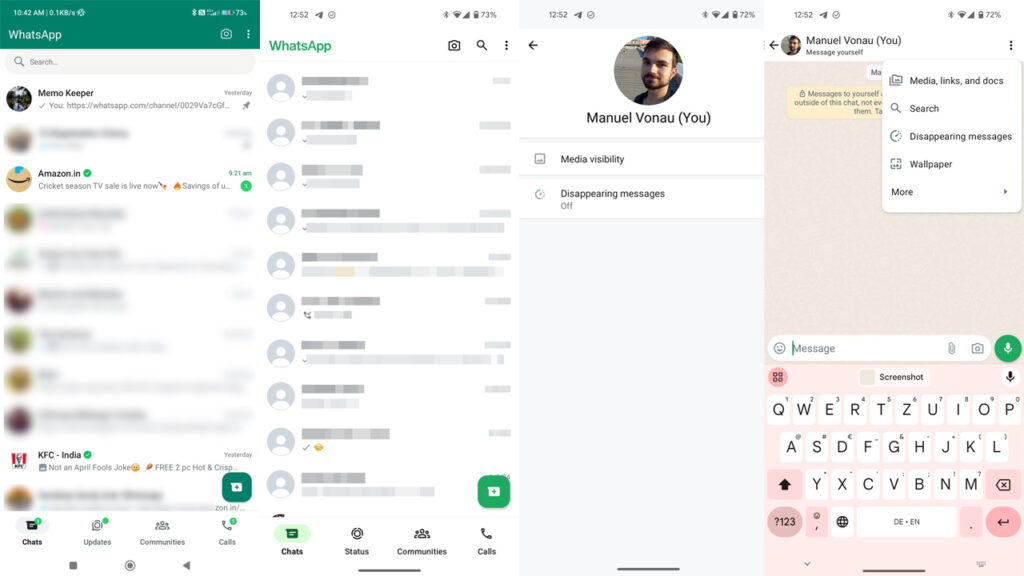
WhatsApp’s new design has also caused some controversy among users. For example, the new bottom bar design can overshadow the search bar, making it difficult for users to search. However, it is seen that such problems are tried to be solved with the updates made in the beta version.
If we take a look at the new colorless design of WhatsApp, we see that we will be faced with a pure white interface. Some may like this simplicity, but some may not want to leave the old green-dominated design.
WhatsApp’s renewed interface continues to be shaped according to users’ feedback. Meta developers aim to continuously make updates to better adapt to users’ needs and preferences. In this way, it is aimed to increase the competitiveness of WhatsApp against its competitors and to make users more satisfied.
What do you think about the new WhatsApp design? Please do not forget to share your thoughts with us in the comments section below.


