
WhatsApp Refines Android Navigation Bar with New Circular Tab Design


WhatsApp is actively updating its Android interface, specifically focusing on the bottom navigation bar to improve visual consistency and user experience. Recent reports from the WhatsApp beta for Android version 2.26.41.7 indicate that developers are transitioning from the current ‘pill-shaped’ indicator for active tabs to a more modern, circular design. This iterative change aims to make the currently selected section more prominent for users. While the feature remains in internal development and has not yet been rolled out to the public beta testing branch, it highlights the company’s ongoing commitment to refining the platform’s aesthetics on the Android operating system.
- WhatsApp is replacing the pill-shaped tab indicator with a circular design in its Android navigation bar.
- The latest design adjustments are being tested within the beta version 2.26.41.7.
- The updated navigation bar retains its floating appearance and rounded corners while removing text labels.
- These design changes remain in the development phase and are not yet available to the general public.
WhatsApp Continues to Refine Navigation Bar Aesthetics
The messaging platform has been experimenting with various iterations of its Android navigation interface for several months. Initial updates introduced a floating bar design with rounded corners, followed by subsequent changes that stripped away text labels to provide a cleaner, more minimalist look. Each update confirms that the design team is still exploring the best way to balance functionality with a modern, clutter-free appearance for its massive user base.
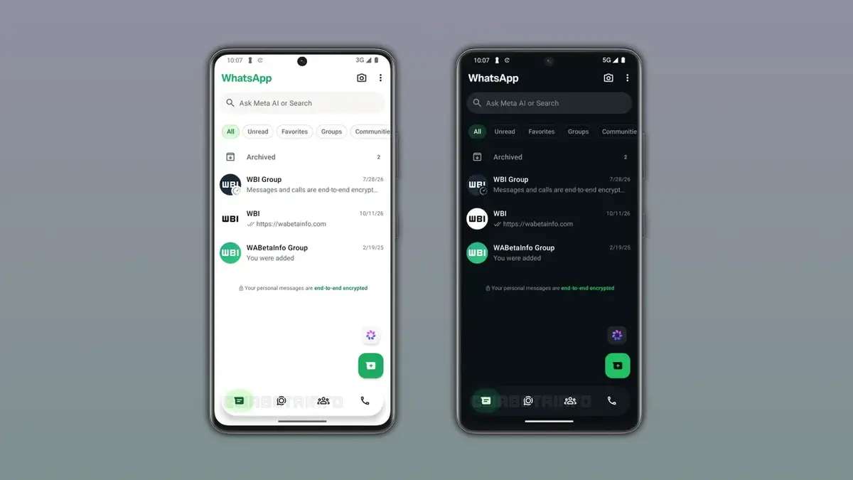
Developers are Testing a New Selection Style
The latest discovery regarding the circular selection indicator shows that the company is prioritizing visual clarity. By moving away from the narrow, horizontally elongated pill shape, the new design utilizes a circular element that sits more prominently beneath the tab icon. This shift suggests that the developers want the active tab status to be easily identifiable at a glance, even with a more simplified interface layout.
New Design Mimics iOS Interface Standards
Industry observers have noted that the new circular indicator bears a striking resemblance to the tab selection style found in the iOS version of WhatsApp. By aligning the Android user experience with its Apple counterpart, the company appears to be moving toward a more unified design language across different mobile platforms. Although the floating bar remains the primary structure, the circular highlight adds a layer of symmetry that enhances the overall professional look of the application.
Design Changes Confirm Ongoing Development Status
The fact that the design of the active tab indicator is still being tweaked confirms that the navigation bar is not yet in its final form. Throughout the last few weeks, the development team has implemented three distinct visual updates to this component, ranging from the floating interface to the removal of text labels and now the change in the selection indicator. These adjustments suggest that WhatsApp is carefully weighing user feedback and internal testing results before finalizing the navigation bar for a global release.
Future Updates Will Define the Final Interface
While the circular style is the current focus, it is possible that further refinements will occur before this feature reaches the stable release channel. WhatsApp has not provided an official timeline for when these navigation updates will be integrated into the main application. Users should expect that the final version of the interface may deviate slightly from these early developmental prototypes as the design team seeks the optimal balance between form and function.
Do you prefer the upcoming circular tab indicator, or do you think the current pill-shaped design is more effective for navigating through your chats? Let us know your thoughts in the comments section below!
Your comment has been submitted,
it will be published after approval.