
WhatsApp Reintroduces Soft Transition Effects to Chat Interface


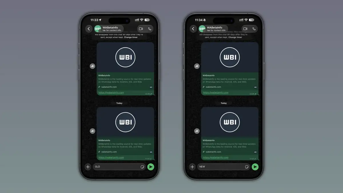
WhatsApp is officially rolling out a refined navigation bar update for iOS 27 users, reintroducing a smooth transition effect to its chat interface. Following the release of the WhatsApp beta for iOS version 26.41.10.18, the messaging platform is moving away from the rigid lines previously imposed by system defaults. This update, which aligns with the aesthetic principles of the Liquid Glass design language, eliminates the harsh visual boundary between messages and the navigation bar. By prioritizing user feedback, developers have created a more fluid scrolling experience, ensuring that messages fade elegantly as they reach the top of the display.
- WhatsApp is reintroducing a soft transition effect for the navigation bar to enhance visual consistency.
- The update replaces the harsh border lines of iOS 27 with a blurred, cohesive transition style.
- Access to this feature is currently restricted to a select group of beta testers through TestFlight.
User Feedback Influences Design Decisions
The popular messaging application faced significant scrutiny after the iOS 27 update introduced a default navigation bar that many users found visually jarring. The operating system’s native implementation utilized sharp, prominent lines that clashed with the fluid, integrated look associated with WhatsApp’s signature Liquid Glass aesthetic. Consequently, the development team analyzed numerous complaints from the user community and decided to leverage the software flexibility provided by Apple’s latest OS to restore a more polished appearance.
New Visuals Enhance the Messaging Experience
The updated transition effect is triggered when users scroll through their conversations. As messages move upward, the navigation bar creates a gradual blur effect, allowing text to fade gently rather than disappearing abruptly behind a static line. This design choice contributes to a sense of depth, making the chat window feel like a unified layer regardless of whether the user is employing light or dark mode. The refinement provides a professional, modern finish that significantly improves the overall user experience during daily interactions.
Limitations Affect Current Feature Availability
At present, this aesthetic improvement is exclusively limited to the chat interface. Other areas of the application, such as the settings menu and contact lists, continue to utilize the standard iOS 27 navigation bar style. It remains unclear whether Meta intends to expand this cohesive design language to the rest of the application ecosystem. Many long-time users are expressing hope that a more unified visual standard will be applied to the entire interface in future updates.
Beta Testing Process Continues Gradually
The rollout of this feature is being handled through a phased approach via TestFlight for beta testers. Because the update is distributed in waves, not all participants will see the change simultaneously. Users who still observe the sharp navigation lines are encouraged to keep their applications updated as the company monitors performance and gathers further telemetry. While an official public release date has not been announced, the positive reception from the testing community suggests a high likelihood of a swift transition to the stable version of the app.
What are your thoughts on this design update for WhatsApp? Do you prefer the new, softer transition effects, or did you find the original design more functional for your daily usage? Please share your opinions in the comments section below.
Your comment has been submitted,
it will be published after approval.