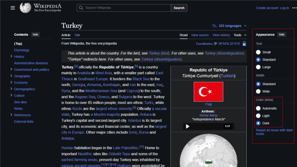
Wikipedia has finally changed its white background that has been tiring the eyes of its users who have been doing research late at night for many years. The dark theme stood out as the most requested feature in 2023 and has finally been implemented. Now Wikipedia users will be able to have an eye-friendly experience on desktop and mobile devices.
How to use the Wikipedia dark theme feature?
Wikipedia’s dark theme feature is available on both desktop and mobile devices. On the desktop version, you can find the “Color (beta)” option by clicking on the settings icon in the upper right corner. If you can’t see this icon, look for a glasses-like icon near the search and account tools.

On mobile devices, you can access the settings menu by clicking on the three horizontal lines in the upper left corner of the page. Select the “Color” option from there. The available options include the standard “Light”, “Dark”, and “Automatic”, which automatically switches based on system settings.
It’s 2024, so why did it take so long to arrive?
At first glance, introducing Wikipedia’s dark theme feature may seem like a simple process. However, many inline styles on Wikipedia include hard-coded colors, making the transition quite difficult. In a discussion on Reddit , it was noted that a largely dark theme could be achieved with simple CSS code. But that a perfect result would require a complete rewrite of the site’s design.
A ticket titled “Provide dark/night mode skin or theme” on Wikipedia’s bug and issue tracker Phabricator dates back to June 22, 2010. Serious activity began on the issue in early 2022, and a large-scale task was finally marked “Solved” on July 12.
Wikipedia’s dark theme feature has been met with great enthusiasm by users. For users who do research late at night, this feature will increase eye comfort and enable them to work longer and more efficiently.


