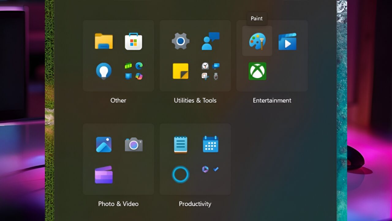
Microsoft is testing a familiar design to make the Windows 11 Start menu more organized and useful. The new design has a structure that is very similar to the app library in Apple’s iOS operating system. It even allows users to organize their apps under 29 different categories. The new layout was introduced to users with a preview update that came with Windows 11 Beta Build 22635.4082.
Microsoft Windows 11 Start menu: 29 categories with iOS-style library design
The new Windows 11 Start menu layout is not limited to applications downloaded from the Microsoft Store. This new arrangement, which covers many different categories from games to travel, security to social media, music to developer tools, entertainment to sports, will allow users to access the applications they need more easily. In other words, it will allow you to put an end to the clutter on your desktop and step into a desktop where everything is organized.
In fact, the first signals of this feature appeared in Microsoft’s previous Windows 11 Build 22635.3930 version. However, it was not fully functional at that time. But now Microsoft has further developed this layout and made it ready to offer to users. This design, which will be quite familiar, especially for users accustomed to iOS and
Android operating systems, can make the transition to Windows 11 easier.
If you want to try this new layout, you may need some technical knowledge. To enable this feature , you need to use a tool called ViveTool. With this tool, you will be able to easily activate the new category layout and switch to the new Windows 11 Start menu.

Microsoft plans to make Windows 11 easier to use. This layout can be more enjoyable than before, especially for those who love order in the digital world and want everything to be in its place on the desktop.


