
YouTube’s design has changed! Is this how it will be?

The design of the video streaming platform YouTube, which we use almost every day for content consumption, has changed. The company has started testing a new layout for the classic video viewing page. Here is the new YouTube design!
YouTube’s design has changed!
In the new layout we discovered, there is no change on the YouTube homepage. However, there are significant changes on the video viewing page.
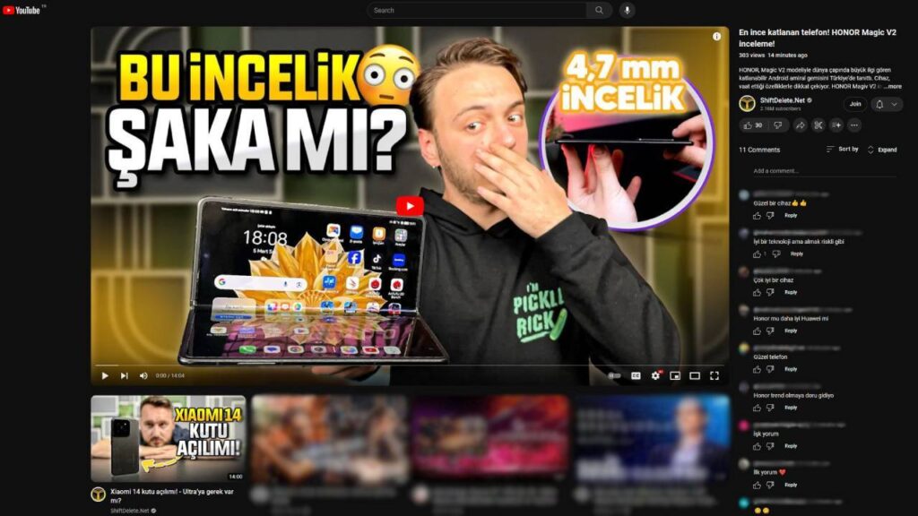
Looking at the new design, there is a larger video playback area compared to the old one. The video title, description, and video comments appear to have been moved to the right side, similar to a live broadcast.
YouTube’s paid feature becomes free!
In the old design, the area for recommended videos, which was on the right side, is now positioned below the video player in a list format with a quad-card design. YouTube may still be testing this design, as no official announcement has been made yet.
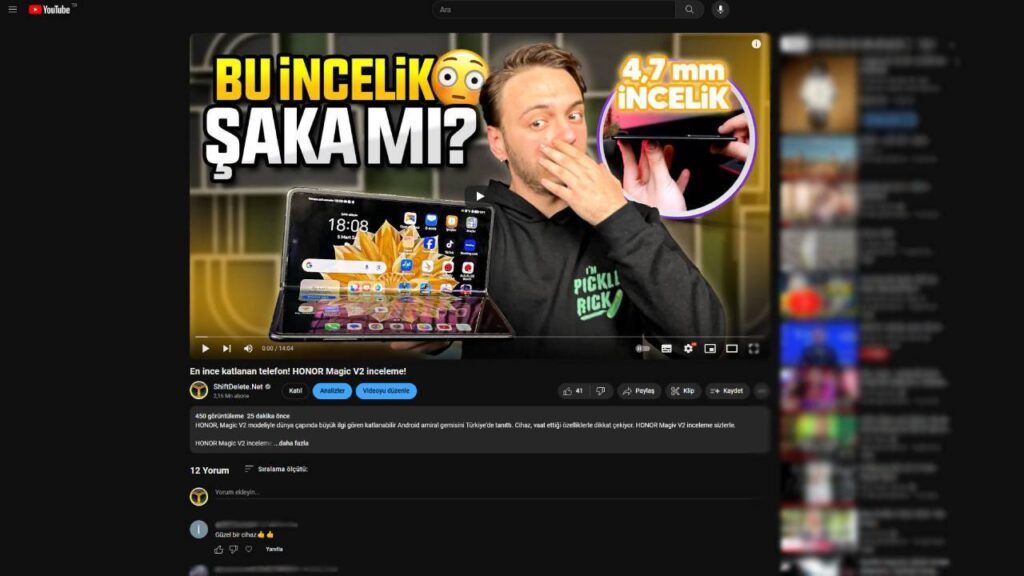
YouTube is known for making such changes usually without prior notice, by randomly opening them to users, but the new layout seems to be challenging for many users and even content creators. Additionally, it is not yet clear whether this change will be permanent.
How do you find the new design that YouTube is testing? Let’s meet in the comments.
Your comment has been submitted,
it will be published after approval.