YouTube is redesigning its video player!

YouTube is making a comprehensive design change to its video player after 10 years. The world’s largest video sharing platform has started to launch its new video player for the web version. The design, which is currently being tested by a limited number of users, includes significant changes.
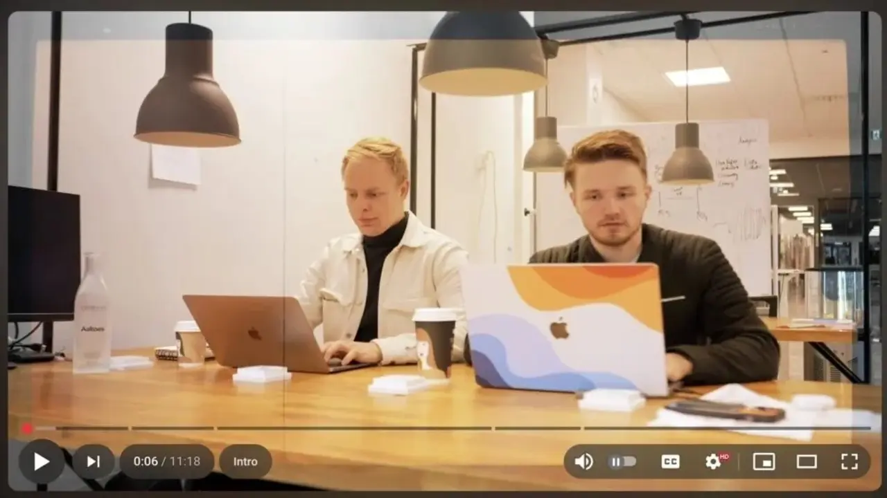
YouTube is renewing the design of its video player
The new interface is based on the “Material Design 3” design language that Google has used in its other services in recent years. Thus, the control buttons in the user interface will now have a semi-transparent appearance.
In addition, each control key will be positioned in a separate section in the form of a capsule. This arrangement aims to make the overall appearance more modern, cleaner and simpler.
The most striking change in the new design is the volume control mechanism. The volume setting, which was previously located in the lower left corner of the video player, is being moved to the lower right corner with the new design. When the user clicks on the volume icon, they are presented with a vertical slider instead of a horizontal volume bar.
In addition, the functionality that allowed the volume to be adjusted with the up and down arrow keys on the keyboard in the previous design has also been removed with the new design. This change has caused dissatisfaction, especially among users accustomed to keyboard shortcuts.
YouTube is currently rolling out the new video player interface to a limited group of users through A/B testing. The feedback gathered during this process will determine whether the new design will become permanent.
So what do you think about these innovations? You can share your views with us in the comments section below.
Your comment has been submitted,
it will be published after approval.