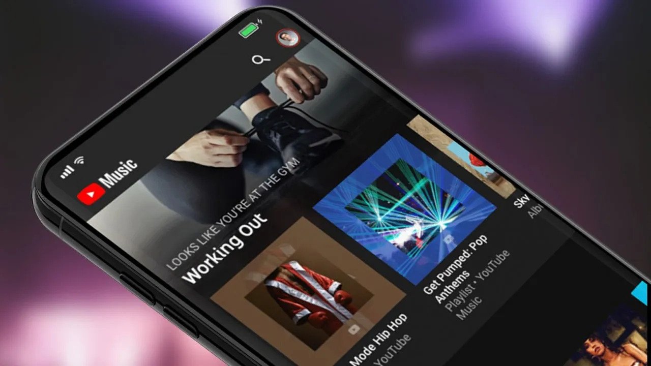
YouTube, with its streaming service YouTube Music, which focuses on the music world, serves millions of users. The company is making some changes to provide a better experience for its users, and one of these changes has emerged today. The latest update is a redesign of the YouTube Music interface. Here are the details!
The YouTube Music web design resembles YouTube
When YouTube Music was first released, it faced a lot of criticism for replacing Google Play Music. However, with each update, the company has managed to improve the music service. Now, it is presenting users with a more impactful design change.
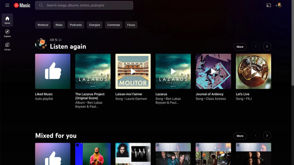
The recent change in YouTube Music has been updated in the web version. The new design reorganizes the Home, Explore, and Library sections by moving them to a new sidebar. Previously, there was a top tab navigation. However, in the new design, there is now a search bar to help you search for songs, albums, artists, or podcasts.
Additionally, the menu icon next to the YouTube Music logo in the upper left corner allows you to expand the sidebar. This provides faster access to your playlists in the library. Furthermore, at the top of the section, there is a button that allows you to create a new playlist from anywhere in the app.
In addition to all of this, the sidebar disappears completely in narrower window sizes. To access it, you need to click on the three horizontal line menu icon. The design makes the YouTube Music website resemble the regular YouTube web version.
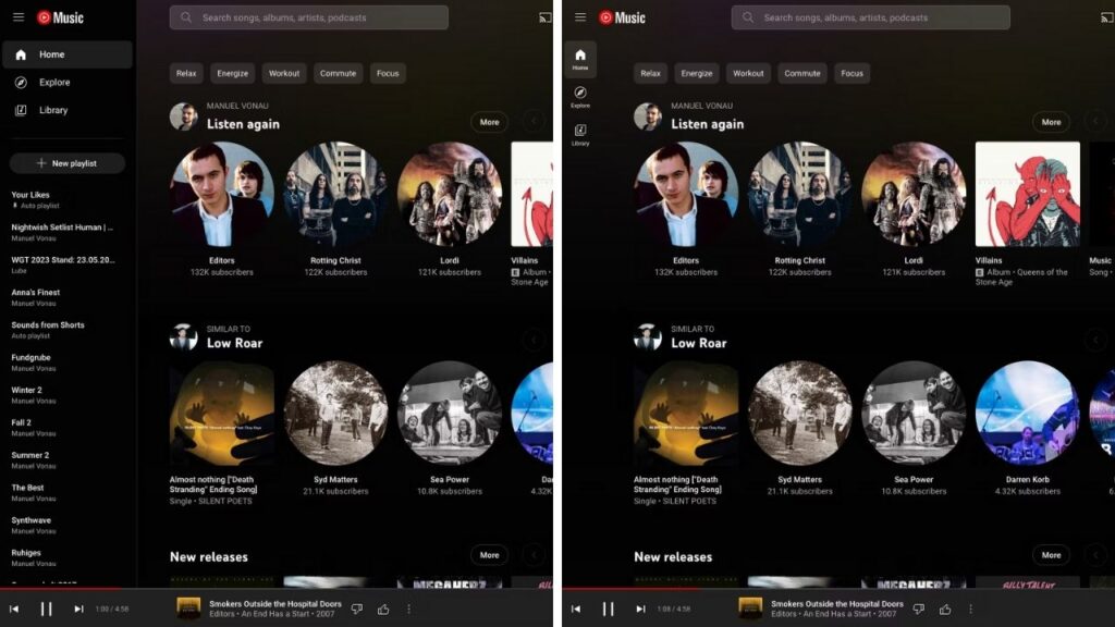
Additionally, YouTube Music still offers an extended phone interface on tablets. There are expectations for the new design to be introduced for tablets and foldable devices with the widespread adoption of the new desktop design.
By the way, what do you think about the new design of YouTube Music? Don’t forget to share your thoughts with us in the comments section!


