YouTube Music Updates Its Interface with a New Search Layout
YouTube Music is rolling out a significant design update to its mobile application, moving the search function directly into the bottom navigation bar to streamline the user experience. This structural change, which affects both Android and iOS versions of the platform, replaces the previously positioned ‘Explore’ tab with a dedicated search icon. By integrating search into the primary menu, the company aims to provide a more intuitive and accessible browsing experience for its global user base. This update follows a series of design adjustments implemented earlier this year, marking another step in Google’s effort to standardize its music streaming interface across mobile devices.
- YouTube Music has integrated the search function into the main bottom navigation bar to improve accessibility.
- The update replaces the previous Explore tab with a dedicated search button for easier navigation.
- The new interface layout aligns YouTube Music with standard design patterns found in competing streaming services.
- The rollout is currently available for Android version 9.21 and iOS version 9.22 users.
Search Functionality Receives a Strategic Placement
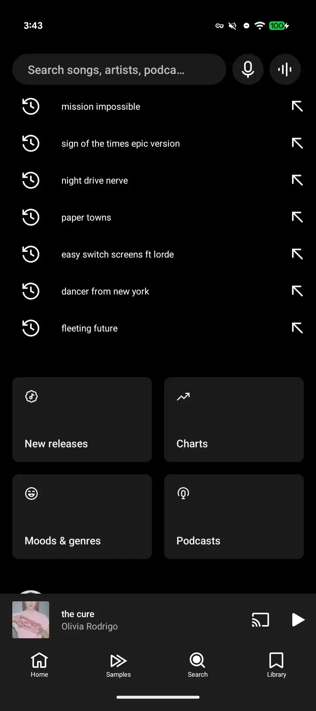
The new search button is now a permanent fixture in the bottom menu, specifically designed to simplify one-handed operation for mobile users. When users interact with the magnifying glass icon, the application immediately prompts the keyboard for text input, while maintaining existing voice and song recognition capabilities. This transition ensures that search remains at the forefront of the user interface.
Placing the search bar in the bottom menu directly reflects modern mobile design trends focusing on ergonomic efficiency.
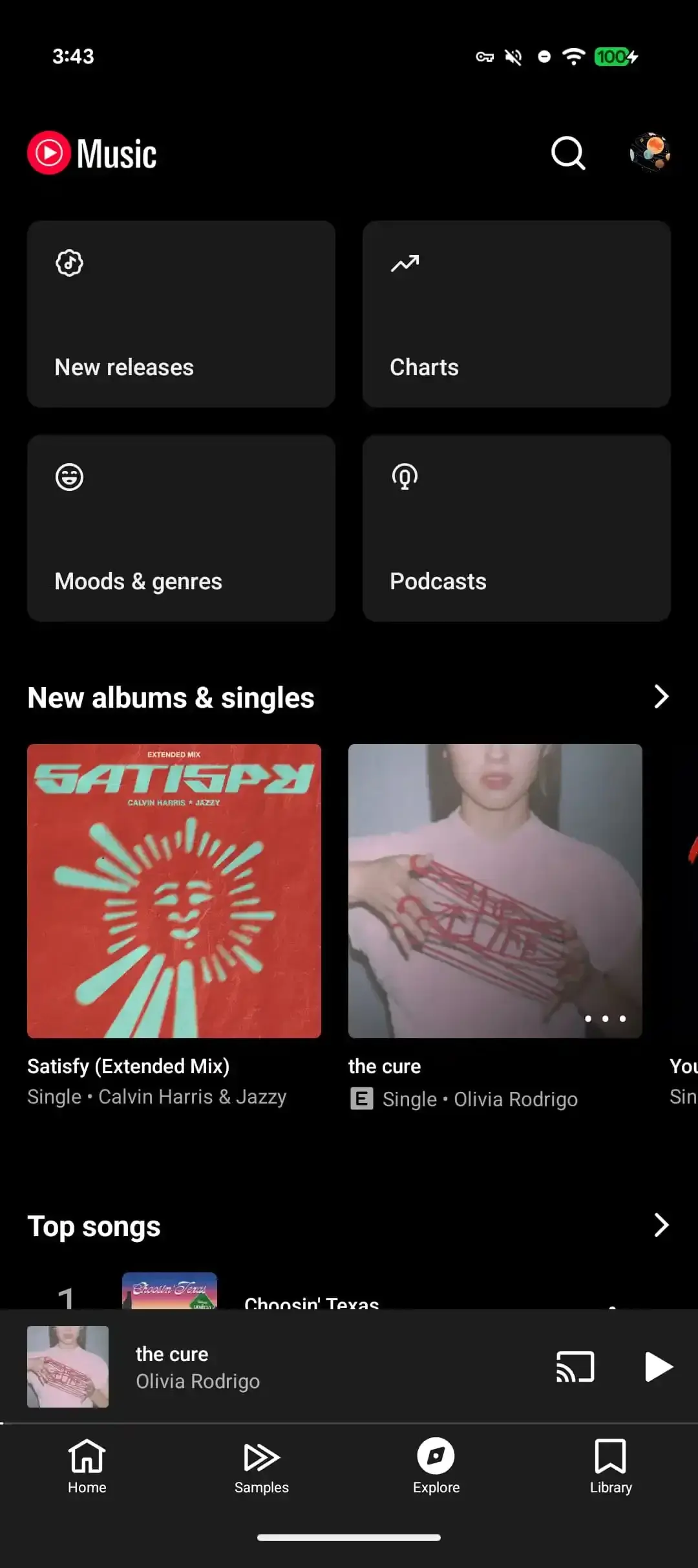
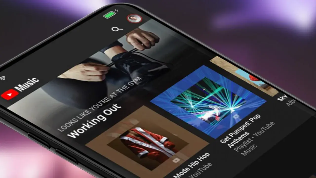
Upon accessing the search tab, users are presented with a variety of content categories previously housed under the Explore page. This includes access to new releases, curated playlists, mood-based collections, and podcasts. Furthermore, the search screen displays recent query history and personalized recommendations to assist users in discovering new music more effectively. The top-right corner of the application has been decluttered, now serving strictly as a hub for profile management, notifications, and activity logs.
The Interface Alignment Enhances User Navigation
Google has been testing this revised layout for an extended period, ensuring that the final implementation provides a consistent experience across different operating systems. This layout update brings the YouTube Music interface closer to the design standards observed in other leading music streaming platforms. The focus remains on reducing the number of taps required to find content, thereby making the application faster and more responsive for daily listeners.
The update is currently being distributed to users globally via version 9.22 for iOS and 9.21 for Android. Users who have not yet observed these changes in their application are encouraged to force-stop the app or check for updates in their respective app stores to trigger the refresh. These refinements are part of a broader initiative by the development team to optimize mobile navigation and consolidate core features into a single, accessible menu structure.
We would love to hear your thoughts on this navigation update; does the new placement of the search button make it easier for you to find your favorite songs, or do you miss the old layout?
Your comment has been submitted,
it will be published after approval.