Google Play Store is getting a design change!
Google is launching a comprehensive visual transformation with Android 16. The first signs of this transformation emerged with the new design of the Play Store. This new design language called “Material 3 Expressive” was first seen in the 46.5.19 version of the Play Store. The application will now have a more colorful, lively and modern appearance.
The Play Store will make a design change
The new interface change is not implemented directly with an application update, but as a server-side edit. For this reason, different interface experiences can be experienced even among users using the same version.
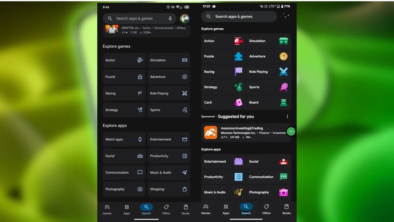
While some sections within the application retain their place with the update, a significant renewal, especially in the use of icons and colors, is striking. The category icons have been completely renewed. The icons are now more striking with vibrant color transitions.
Visual improvements have also been made in sections such as Popular Applications, Discover Applications and Discover Games. These areas are now more prominent. There is no change in the Search tab.
Material 3 Expressive is not limited to the Play Store. With Android 16, many of Google’s system applications are compatible with this new design approach. Similar changes are also noticeable in the Gmail application.
With Android 16, Google plans to present this design approach not only as a visual innovation, but as a holistic user experience spreading across the entire system interface. So what do you think about this? You can share your views with us in the comments section below.
Your comment has been submitted,
it will be published after approval.