Today, almost all Android smartphone manufacturers, except Samsung, use the Google Phone app by default for searches. The latest developments indicate that the application will soon have a brand new look. The application, which is preparing to appear with its renewed version, will start to offer an iPhone-like search page design. Here are the details…
Google Phone is getting a more intuitive design
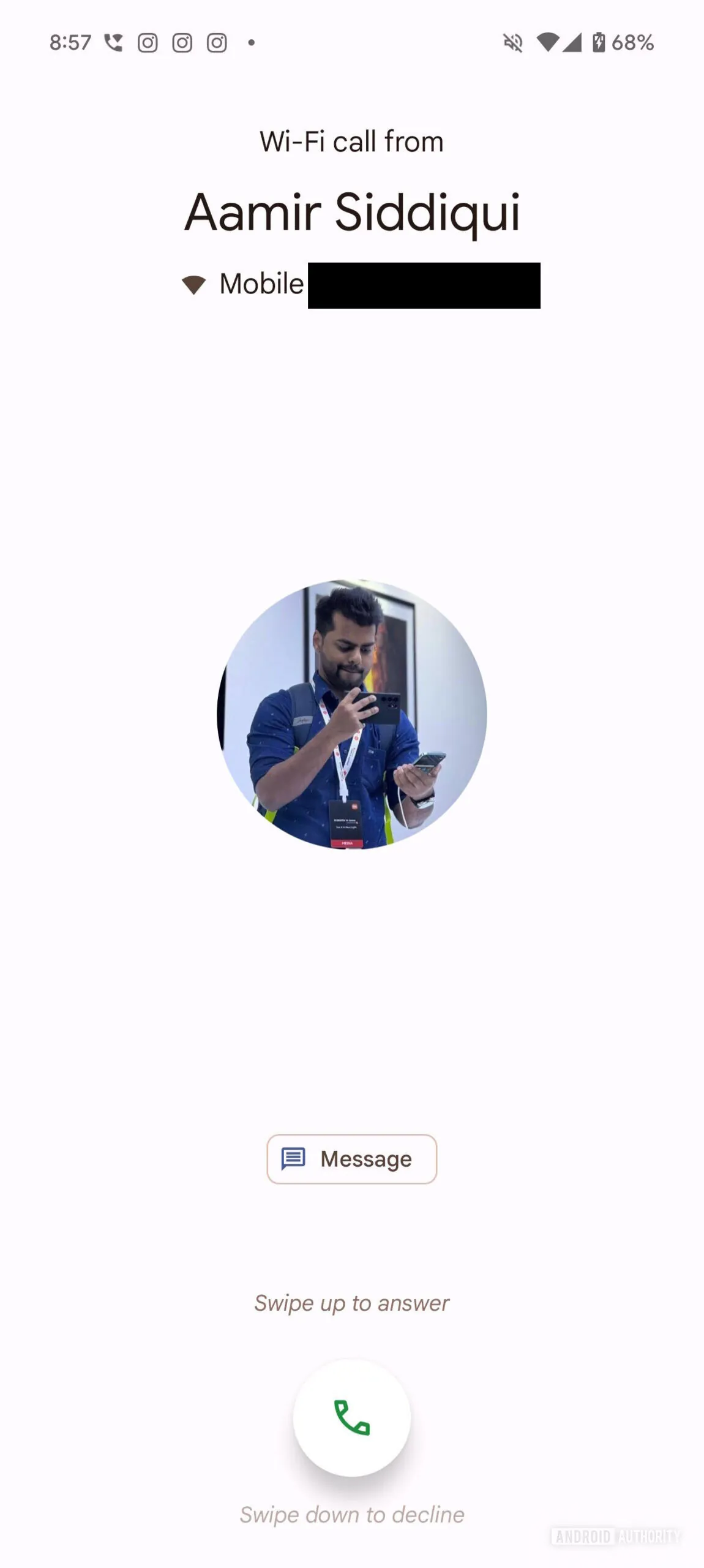
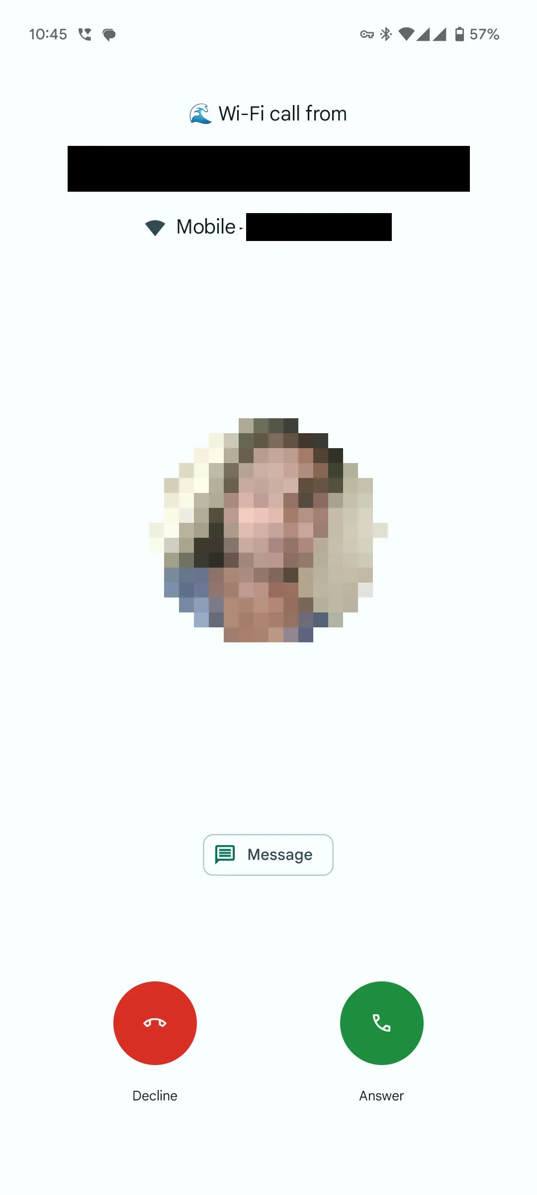
According to information shared by Android Authority, Google is testing a new incoming call screen for the Phone app. This new design was detected in the latest version of the app (v145.0.672690850). You can examine the comparison of the old and new design in detail in the image below.


As you can see, the new design brings a very close view to the iPhone’s call screen. According to the new design, instead of a single button to accept and reject calls, the user will start to see two buttons, green and red, to accept and reject calls.
Despite its similarity with Apple smartphones, some users seem to be pleased with this possible design change. This is because it makes the call screen a little more intuitive for new users, as well as making it difficult to accept or reject calls by mistake.
For now, this new design is not available even when installing the latest version of the Phone app. It appears that Google is running the tests on a separate server. In any case, if the app development team deems the update valid, it seems quite likely that we will see the new feature working in the next few weeks.
What do you think about the new design?


