Luxury car brand Bentley has changed its logo!

Bentley has renewed its logo for the fifth time in its 106-year history. The iconic emblem known as the “Winged B” has undergone a comprehensive overhaul for the first time since 2002. The new logo will be displayed live for the first time on a Bentley concept car on July 8. The opening of the new three-story design studio at its headquarters in Crewe, England, will also be held on the same day.
Bentley brand has renewed its logo
The new design stands out as the version with the most obvious visual differences among the logos the brand has used so far. While the basic form is preserved, the wings are made more pointed, and the entire structure is enclosed in a thick frame.
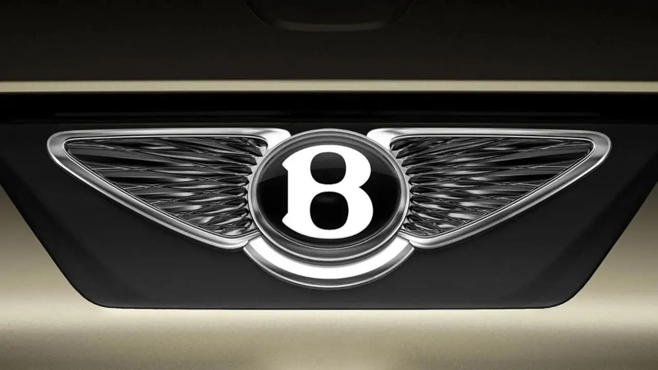
The feather details at the bottom are no longer present. The letter “B” is made more pronounced; it is highlighted with shadows and highlights. Bentley has taken a step towards maintaining its own unique style by not joining the flattened logo trend frequently seen in the automotive and design world in recent years.
Bentley design director Robin Page, who led the design process of the logo, described the new logo as simpler, sharper and more impressive than previous versions. It was also stated that this renewed visual identity carries a symbol of the future of the brand’s handcrafted products.
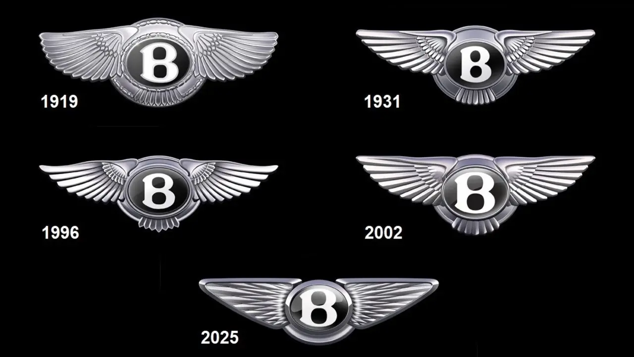
Bentley’s first logo was designed by Frederick Gordon Crosby in 1919. It has been changed a total of five times to date, in 1931, 1996, 2002 and most recently in 2025.
The new logo is not only an aesthetic update, but also a symbol that carries the brand’s vision for the future. With this innovation, Bentley remains loyal to its history and heritage while redefining its place in modern automotive design.
Your comment has been submitted,
it will be published after approval.