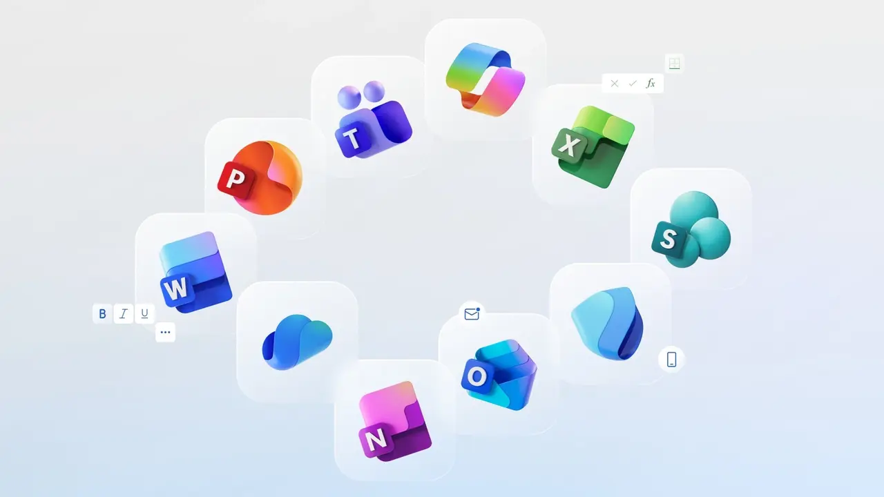
Microsoft has officially unveiled its biggest overhaul of the icons for its core Office apps since 2018. The company has redesigned the icons for all 10 core Office apps, giving them a more colorful, fun, and modern look.
Office app icons will change
The new icons align with Microsoft’s recent Fluent illustration work and feature subtle design changes. The company states that this visual refresh was inspired by the icon for Copilot, the artificial intelligence assistant that has been more fully integrated into Microsoft 365.
Jon Friedman, Vice President of Microsoft 365 Design and Research, explains the primary purpose of the new icons. Friedman explains that the designs reflect the language of today’s business, including “connection, harmony, seamless collaboration, and fluid transitions.” He says the new icons are simpler, more intuitive, and accessible, while also conveying a sense of fluidity and fun.
Among the design changes, the use of more pronounced color transitions, similar to Google’s logo redesign, is noteworthy. The icons have also been simplified. For example, the four horizontal lines in the Word icon are now three for easier readability at smaller sizes.
Friedman summarizes the design language by saying, “We’ve moved away from angular, rigid, and static forms and toward softer, more fluid lines. Instead of sharp edges, there are curves and arcs, which give the icons a sense of movement and intimacy.”
Microsoft will begin rolling out the new icons gradually in the coming weeks. The updated icons will be available on web, desktop, and mobile platforms for both individual and corporate Microsoft 365 users.