
WhatsApp Develops New Customizable Chat Themes for iOS Users

Meta-owned messaging platform WhatsApp is currently developing a new set of highly anticipated chat themes for its iOS application, as revealed in the latest WhatsApp beta for iOS 26.31.10.74 update. This significant interface overhaul aims to provide users with a more personalized experience, allowing for visual adjustments that were previously unavailable. By introducing a variety of aesthetic options, including animated backgrounds and intelligent color coordination, the company seeks to enhance the overall usability of its messaging environment. While the feature remains in internal development, it represents a major step forward for the platform’s long-term design evolution strategy.
- WhatsApp is testing three distinct categories of chat themes for its iOS application.
- The update introduces animated wallpapers with low-speed motion to maintain user focus.
- The system automatically assigns chat bubble colors based on the chosen background to ensure accessibility.
This upcoming update prioritizes both visual personalization and optimal text readability for all users.
Themes Are Offered in Three Distinct Categories
The new customization system being tested by WhatsApp is divided into three primary categories: Highlights, Doodle, and Minimal. The ‘Highlights’ category serves as the most dynamic option, featuring animated backgrounds that provide a subtle, engaging visual flair without overwhelming the user. WhatsApp engineers have specifically calibrated the animation speeds to be slow and steady, ensuring that the movement does not distract from the core messaging functionality. 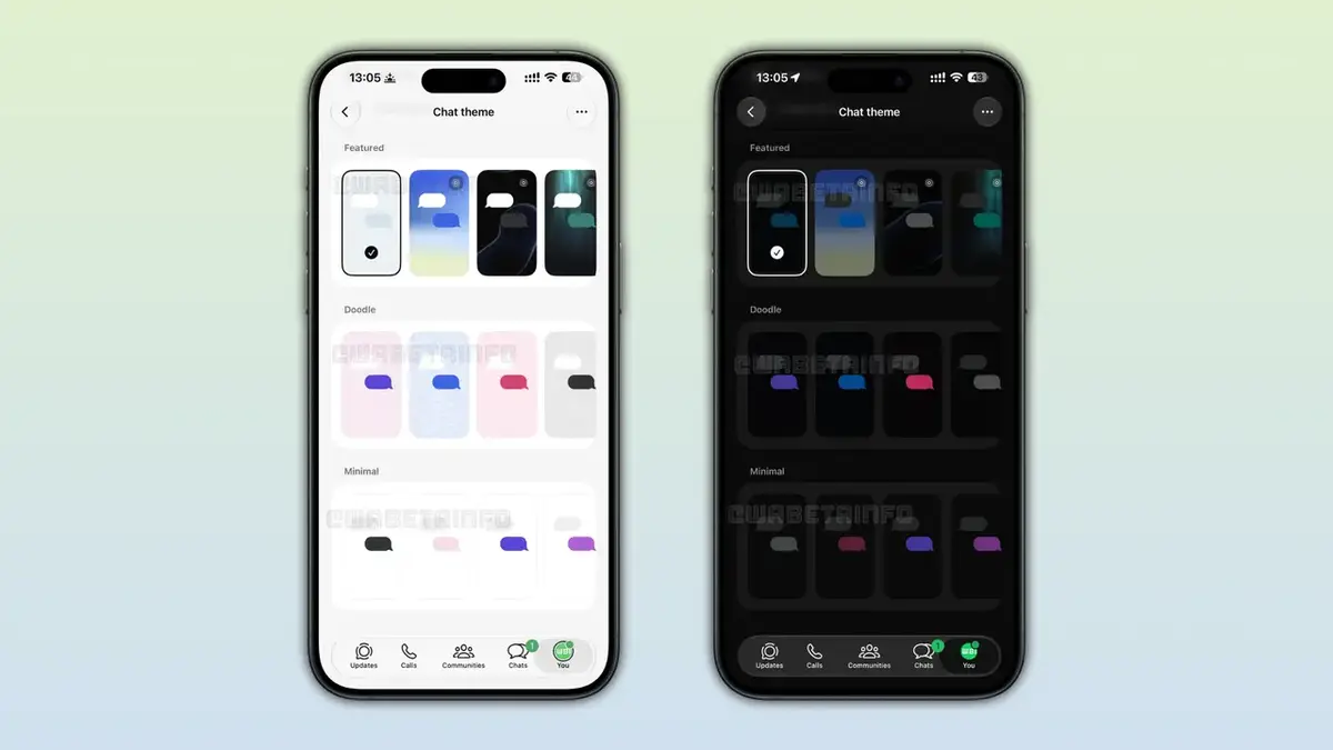
Doodle and Minimal Options Retain Simplicity
For users who prefer a more traditional aesthetic, the ‘Doodle’ category brings back the iconic patterns that have long defined the WhatsApp interface. Conversely, the ‘Minimal’ category caters to those seeking a distraction-free experience. These minimal themes offer clean, solid light or dark backgrounds depending on the user’s system settings, effectively reducing visual clutter. Both options are designed to streamline the interface, making long conversations easier on the eyes while maintaining the recognizable character of the messaging service.
These design choices reflect a commitment to balancing modern aesthetics with established user preferences.
Automated Color Selection Ensures Accessibility
One of the most technically impressive aspects of the new theme system is the automated management of chat bubble colors. When a user selects a specific theme, the application intelligently analyzes the background to determine the most appropriate contrast colors. This mechanism prevents text from blending into the backdrop, ensuring that readability remains at an optimal level regardless of the visual intensity of the wallpaper. By enforcing these contrast standards, WhatsApp maintains its commitment to accessibility while allowing for a high degree of personalization.
Development Process Currently Continues
As of now, the feature is hidden within the beta version of the application and has not been made available to general test participants. The development team is actively refining the interface to ensure that the transition between different themes remains fluid and stable. While there is no official release date for the public rollout, the system is expected to eventually bridge the gap between iOS and Android, providing a consistent experience across both major mobile platforms. The company continues to prioritize stability and performance as it integrates these new design layers into the existing framework.
We are eager to hear your thoughts on these upcoming design changes. Would you prefer to have full control over your chat bubble colors, or is the automated intelligent selection by WhatsApp more convenient for your daily use? Please share your opinions in the comments section below.
Your comment has been submitted,
it will be published after approval.