
WhatsApp Updates Android Design With New Chat Bar Features


Meta-owned messaging giant WhatsApp is currently testing significant refinements to its Android interface, specifically focusing on the chat bar experience. According to details emerging from the WhatsApp beta for Android version 2.26.41.11, the company is developing two distinct design prototypes aimed at modernizing the text input area. These updates, which are still in the early development phase and have not yet reached beta testers, reflect the platform’s ongoing efforts to streamline navigation and consolidate UI elements for a more cohesive user experience. By adjusting the layout of the message input field and the send button, WhatsApp aims to improve overall interaction efficiency across its mobile application.
- WhatsApp is testing two distinct chat bar layouts to enhance the Android messaging experience.
- The new designs integrate the send button directly into the text input bar for a cleaner aesthetic.
- These features remain in internal development and are currently unavailable to public beta users.
- The company seeks to establish a more consistent visual language across its entire application interface.
WhatsApp Explores New Interface Design Options
In a continuous push to modernize its ecosystem, WhatsApp has initiated experiments regarding the placement and functionality of the chat bar. The primary objective of these internal tests is to create a more organized layout that minimizes visual clutter. In the current iteration, the send button often appears as a distinct, separate element; however, the proposed updates aim to embed this functionality directly within the chat bar itself. This architectural shift is expected to provide a more intuitive environment for users, allowing for a smoother transition between typing and sending messages.
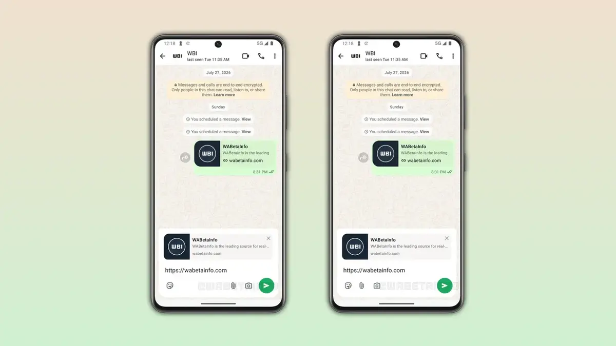
First Prototype Retains Familiar Structural Elements
The first design option developed by the engineering team prioritizes a balance between innovation and user familiarity. This version keeps the general arrangement that long-term users are accustomed to but introduces subtle shifts in icon placement. The emoji button remains on the right side of the bar, while the camera and attachment icons are shifted to the left, flanking the text input area. By moving the input field to the upper section of the bar, developers have successfully created a more expansive space for text entry, which may help users draft longer messages with greater ease.
Second Prototype Offers a Minimalist Aesthetic Choice
The second design prototype takes a bolder step toward minimalism. In this layout, the functional icons—specifically the emoji, attachment, and camera buttons—are grouped together on the left side, leaving only the send button on the extreme right. This creates a balanced, uncluttered look that frees up the screen space. By stripping away extraneous design elements, WhatsApp hopes to reduce distractions, providing a cleaner canvas for communication. The company is currently evaluating these options against internal usage metrics to determine which approach yields the highest level of user satisfaction.
Development Teams Continue Rigorous Testing Processes
It is important to note that these potential changes are still in the early stages of the development cycle. WhatsApp is well-known for its iterative design process, often testing several versions of a single feature before deciding on a final implementation. Similar to the recent optimizations made to the bottom navigation bar, these chat bar improvements are subject to change based on real-world feedback and technical testing. As such, the features seen in current leaks may differ significantly from the version that eventually rolls out to the general public. Developers are carefully monitoring performance data to ensure the final product maintains the platform’s high standards for responsiveness and stability.
We are eager to hear your perspective on these potential design changes for WhatsApp. Do you believe moving the text input field and adopting a more minimalist button layout will improve your daily messaging flow, or do you prefer the current design? Let us know your thoughts in the comments section below.
Your comment has been submitted,
it will be published after approval.