
YouTube Music Tests Immersive Full-Screen Design for Now Playing


YouTube Music is currently testing a significant redesign of its “Now Playing” interface, aiming to provide a more visually immersive experience for its global user base. The new feature allows album art to occupy the entire screen, effectively removing the traditional borders that previously framed music artwork. By transitioning to this edge-to-edge format, the streaming platform intends to modernize its visual aesthetic to better align with the popularity of vertical video content. This ongoing test represents a major shift in how listeners interact with album visuals, signaling a strategic move toward a more dynamic and aesthetic-heavy music discovery experience on mobile devices.
- YouTube Music is testing a full-screen “Now Playing” interface that displays album art across the entire device screen.
- The design update shifts away from square-formatted art to a rectangular, edge-to-edge presentation.
- Users can toggle between the full-screen immersive view and the standard interface by interacting with the album cover.
- Playback controls and progress bars are repositioned to ensure they do not obscure the primary visual content.
New Design Enhances the Visual Experience
The experimental interface pushes artwork to the absolute edges of the display, including the status bar and navigation areas. While this approach occasionally results in the cropping of certain images to fill the rectangular space, it provides a more expansive canvas that feels modern and uncluttered. 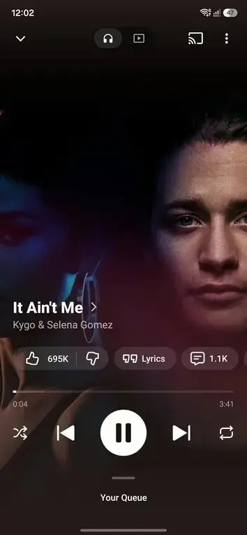
This aesthetic approach reflects a design philosophy reminiscent of the former Google Play Music era.
User Controls Undergo Modernization
Recent refinements ensure that essential playback controls and progress indicators are not hidden behind the artwork. By adopting a cleaner layout, the developers have improved accessibility while removing the previously used adaptive color-theming engine that once dominated the background. This change contributes to a more uniform and sophisticated look, allowing the album art to stand out without the distraction of fluctuating interface colors. The buttons have also been updated with transparent backgrounds to maintain focus on the music’s visual identity.
This full-screen implementation is currently in the testing phase and has not yet been rolled out to the general public.
The integration of this design extends to music videos, where a similar full-screen effect is applied, mirroring the vertical viewing habits popularized by platforms like YouTube Shorts. This move highlights YouTube’s broader commitment to aligning its music service with current trends in mobile media consumption. By prioritizing high-impact visuals, the platform hopes to increase user engagement and provide a more premium, distraction-free environment for music lovers. It remains to be seen when or if these features will reach a stable, global release, as the company continues to gather feedback from early testers regarding the transition from traditional album viewing to this new, experimental format.
How do you feel about the potential shift to a full-screen album art experience in YouTube Music; does it make your listening sessions feel more engaging, or do you prefer the classic layout? Let us know your thoughts in the comments section below.
Your comment has been submitted,
it will be published after approval.