YouTube, the world’s most popular online video sharing platform, has changed its design today. YouTube, which completely changed the design of the area where we watch videos, moved the information and comments section aside and moved the recommended videos below the watched video.
YouTube changed the design of the video screen!
YouTube has been testing the new video viewing screen for a while. Youtube, which could not keep its new design secret last month, is now ready to change the design for all users. YouTube, which launched its new viewing screen today, takes all the details such as video title, description, channel information and comments below the watched video. The recommended videos, which have been on the side so far, are located below the watched video.
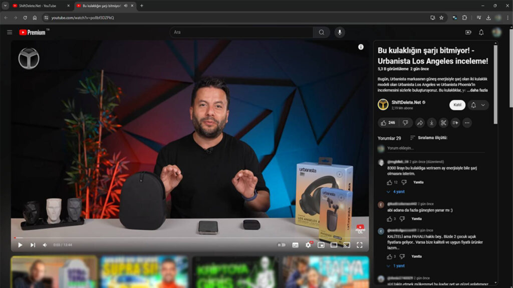
As you can see in the image, YouTube plans to minimize distractions and placed this panel on the side of the screen so that you can access video-related information more easily. The platform, which moves other videos related to this video or other recommended videos down, actually aims to draw attention to the video being watched, even though it may seem strange at first glance.
This new design, which is currently available to some users, is not known exactly when it will be available to everyone. Likewise, while some YouTube users encounter the new design, some still use the old design. It is also among the leaks that this service will be provided to Premium users in the first stage. How do you like YouTube’s new viewing screen? Is the old design better or the new design? We welcome your ideas in the comments.


