
Google Messages Rolls Out New Long-Press Menu Design

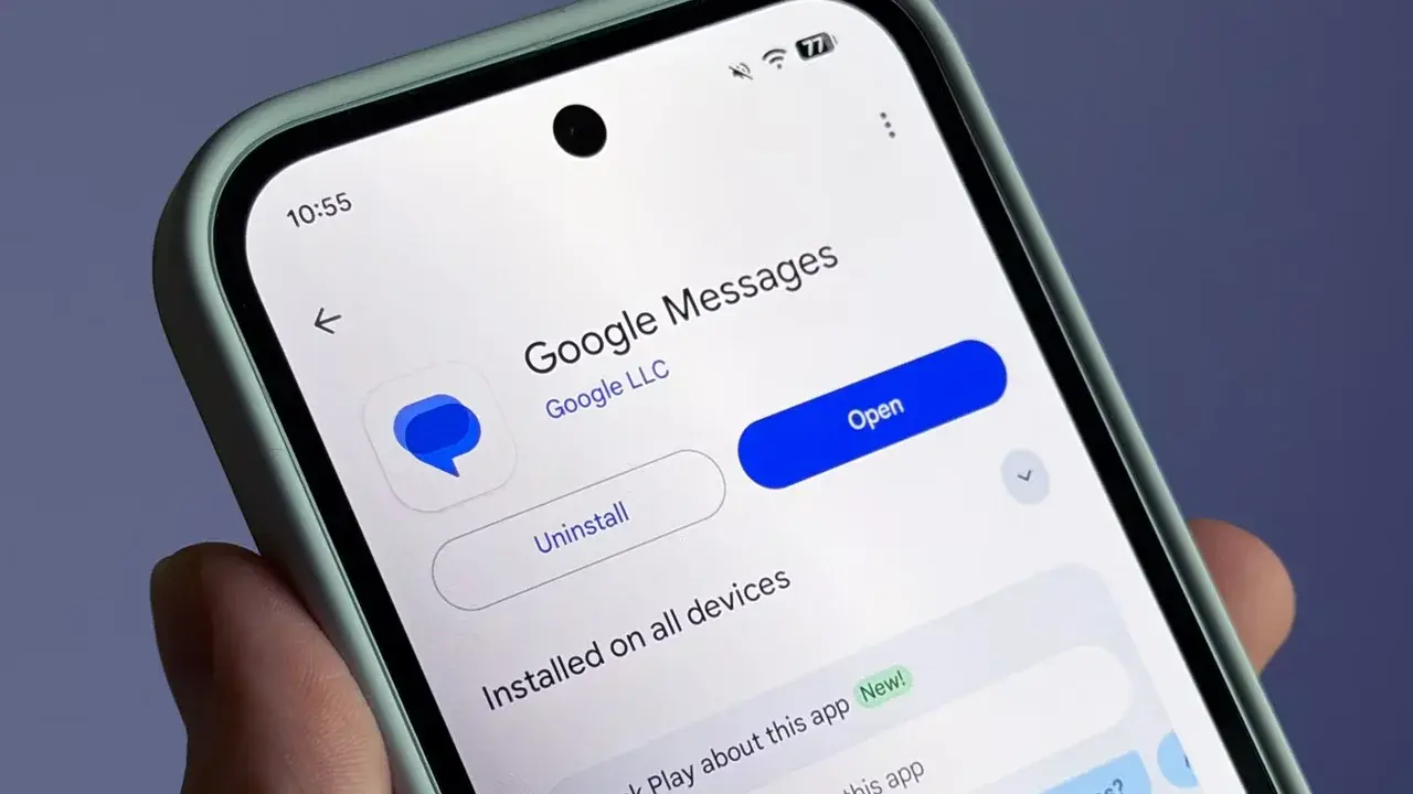
Google has officially begun the rollout of a redesigned long-press menu for its Google Messages application, aiming to enhance user experience and facilitate easier one-handed navigation. Currently available to users participating in the latest beta version of the messaging platform, the update replaces the traditional top-aligned toolbar with a more intuitive and accessible list interface. This significant UI overhaul is being distributed as a server-side change, meaning that while the feature is currently active for many beta testers, some users may experience a slight delay before the new Google Messages menu appears on their devices.
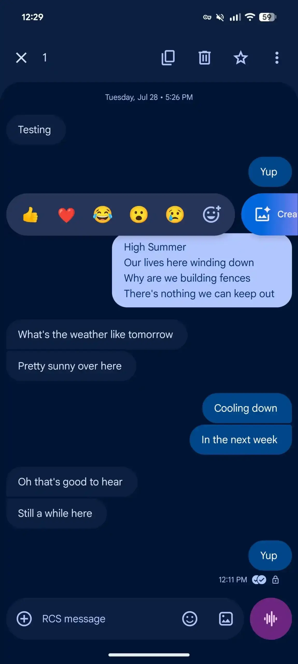
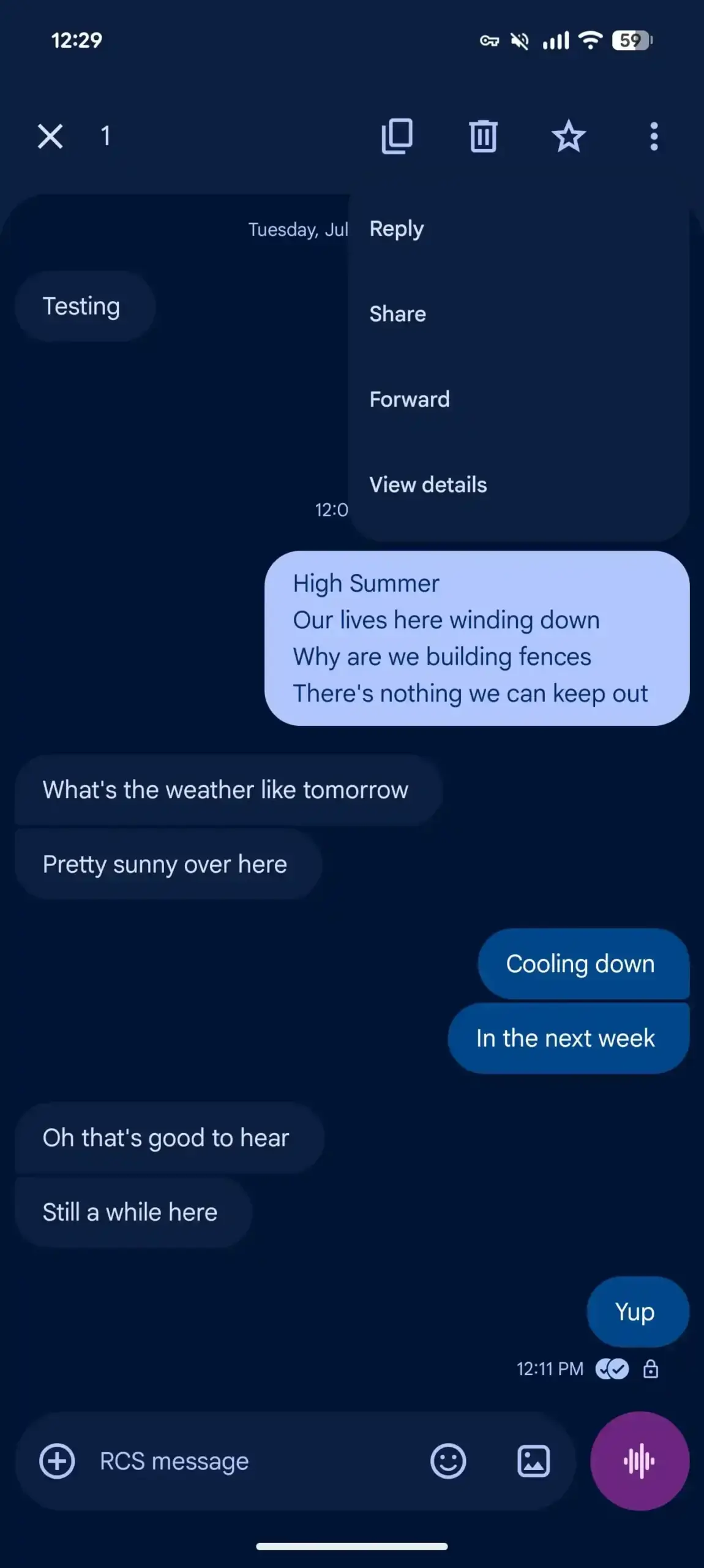
- The updated interface replaces the legacy top-aligned toolbar with a comprehensive, easily accessible list of message actions.
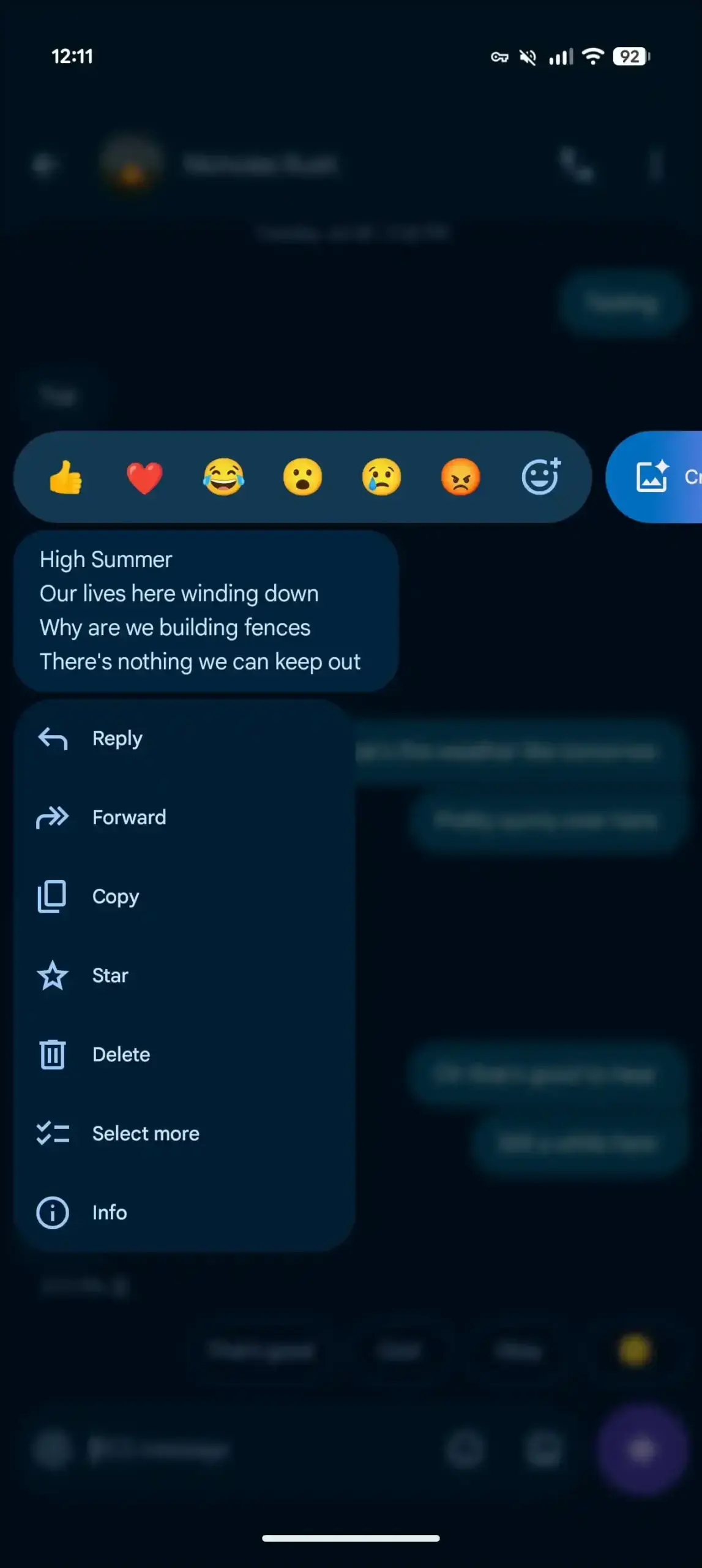
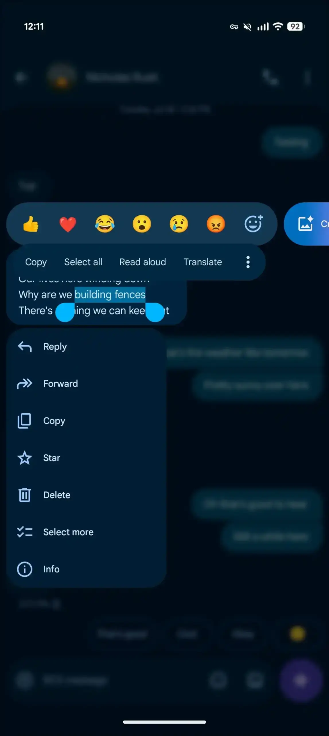
- Google has introduced a blur effect to the background to ensure that the selected message remains the primary focus.
- The update provides improved precision for text selection by allowing users to copy specific segments rather than entire messages.
- New features are currently being deployed via a server-side update for users running the 20260731_00_RC00 beta build.
The New Menu Design Enhances User Interaction
The previous iteration of the Google Messages long-press functionality relied on a toolbar located at the top of the screen, which often forced users to reach across the display. This design choice frequently hid secondary options behind a three-dot menu, creating unnecessary friction during common tasks. The new implementation addresses these ergonomic issues by placing a comprehensive list of actions—including reply, forward, copy, star, delete, and save—directly beneath the selected message or media file.
This strategic shift prioritizes ergonomic accessibility and streamlines the overall messaging workflow for millions of global users.
To maintain visual clarity, the application now applies a subtle blur effect to the background when the menu is active. This design choice effectively draws the user’s attention to the available options while dimming the rest of the chat window. If the screen space is insufficient to display the full list of actions, the system automatically shifts the selected item upward, utilizing smooth animations to ensure that the interface feels responsive and polished.
Advanced Text Selection Improves Precision
Beyond the aesthetic improvements, the update introduces a highly requested feature regarding text interaction. Previously, users were often limited in their ability to select specific portions of a message. With the current update, individuals can perform a second long-press to highlight and copy only the precise segments they require. This enhancement significantly reduces the need for manual editing after pasting content into other applications.
Users Can Access the New Interface Now
The update is officially bundled with Google Messages beta version 20260731_00_RC00. Because Google is handling this rollout via server-side activation, the features may not be immediately visible to all beta testers. For those who wish to expedite the process, forcing the application to stop via the device’s system settings can sometimes trigger the refresh required to pull the latest configuration from Google’s servers.
Google continues to refine its ecosystem by prioritizing user-centric design updates that address real-world usage patterns.
We are curious to hear your thoughts on these UI changes, so please share your feedback in the comments section below and let us know if this new menu makes your daily messaging routine more efficient.
Your comment has been submitted,
it will be published after approval.