Google doesn’t shy away from innovations as an operating system for Android. However, while waiting for the stable version of Android 14, Google has unveiled a refreshed Android logo. In the latest version, the operating system has taken on a new look. Here are the details!
The small “a” in Android’s name has changed after many years!
The popular operating system Android is gearing up to make its appearance with new features. Especially with the rapid approach of Android 14, this process seems to be gaining even more momentum. Today, Google presented a refreshed logo for Android.
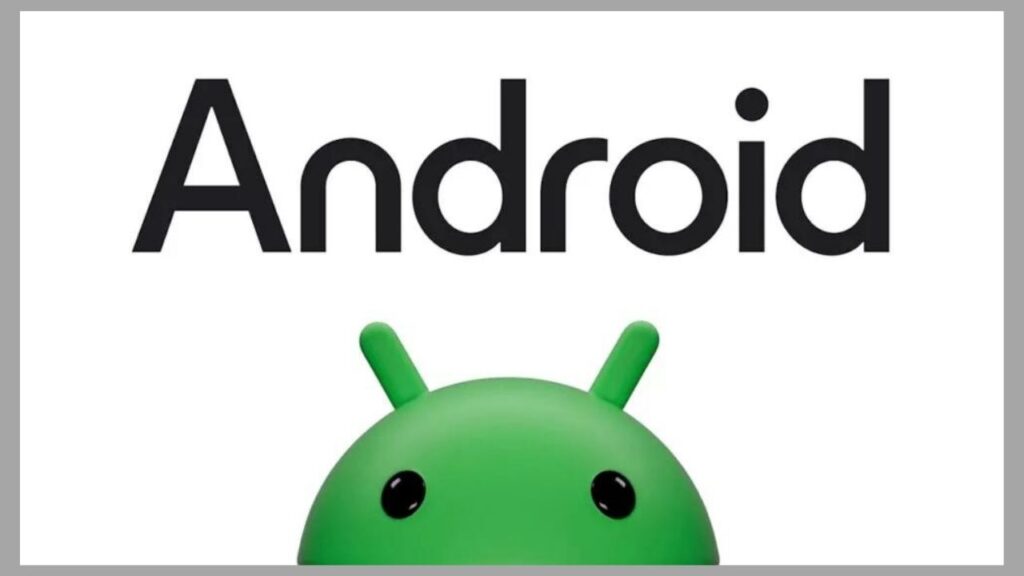
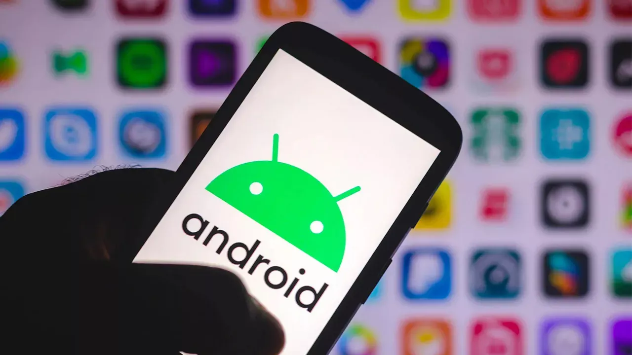
The new brand design announced by the company today comes with innovations that will catch users’ attention. When we look at the innovation, we see that the letter “A” in the word Android is now capitalized, and the letters have a more rounded design.
At first glance, these changes in the Android text may not seem like a significant alteration. However, the first letter of the Android operating system has always been in lowercase since its inception. Therefore, starting the first letter with uppercase is seen as a significant innovation. Additionally, the font style now appears more curved.
Google has made a statement regarding this change in the font style. The company stated that it reflects the Google logo with the aim of “better conveying the relationship between Google applications and services, which people already know, and Android devices.”
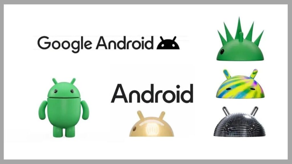
In addition to all of this, we can see some changes in the Android robot, which is the face of the Android brand. The Android brand’s mascot now appears more three-dimensional and with more character. Google has also provided an explanation for this. They stated that they have updated the Android robot and made it easier for it to transition into the real world.
So, what do you think about the new Google Android logo? Don’t forget to share your thoughts with us in the comments section!


